An olive green sofa works with more accent-chair colors than it first appears. Warm cream creates light contrast, camel and cognac deepen its earthy character, rust adds warmth, muted blush softens the room, and navy or blue-gray can create a cooler counterpoint. The right answer depends on the sofa’s undertone, the room’s light and the colors already present in the rug, art and wood.
Instead of choosing from a generic color list, use this guide to identify the exact green, control light-dark balance and test the chair as a complete material object. A chair contributes shape, texture and visual weight as well as color.
Quick Answer: The Most Reliable Chair Colors
| Chair color | Effect with olive green | Best supporting materials |
|---|---|---|
| Warm cream or ivory | Bright, calm contrast | Oak, walnut, boucle, linen-like texture |
| Camel, tan or cognac | Natural and grounded | Leather, warm wood, aged brass |
| Rust or terracotta | Warm focal contrast | Woven fabric, dark timber, clay accents |
| Ochre or muted mustard | Energetic but related | Black metal, walnut, graphic textiles |
| Dusty blush | Soft, quiet complement | Light wood, warm white, subtle brass |
| Navy or muted blue-gray | Cool, tailored contrast | Dark wood, cream rug, brushed metal |
Warm cream is the safest choice when the room needs light. Tan or cognac is the easiest earthy pairing. Rust makes the chair a focal point. Navy works when repeated in art or a rug and when the olive does not become muddy beside it.
First Identify the Sofa’s Olive Undertone
Olive is a family of muted yellow-greens, but individual sofas can lean toward moss, khaki, sage, brown or gray. Place a clean white sheet of paper and a mid-gray object near the upholstery in daylight. The comparison makes yellow, brown and gray undertones easier to see.
A warm, yellow olive usually pairs naturally with cream, caramel, rust and ochre. A grayer olive can accept blue-gray, charcoal and cooler off-white. A dark brown-olive benefits from a lighter chair so the seating group does not become one heavy mass.
Do not rely only on a product photograph. Screen brightness, white balance and surrounding colors alter perception. Take a fabric sample around the room and look at it in morning, afternoon and artificial light.
Use Value Contrast to Keep the Room Readable
Value means how light or dark a color appears. Two different hues with similar value can merge from across the room. If the olive sofa is deep and visually heavy, a pale cream or light patterned chair creates separation. If the sofa is light moss, a richer cognac, navy or terracotta chair can anchor the composition.
Take a phone photograph and temporarily view it in grayscale. If sofa, chair, rug and wall all become the same middle gray, the room may lack hierarchy. Adjust one large element lighter or darker rather than adding many small contrasting accessories.
In compact rooms, lighter chairs often preserve an open view, particularly when they have exposed legs or a swivel base. Our small living room chair guide explains how scale and sight lines affect the choice beyond color.
Warm Cream and Ivory: The Low-Risk Pairing
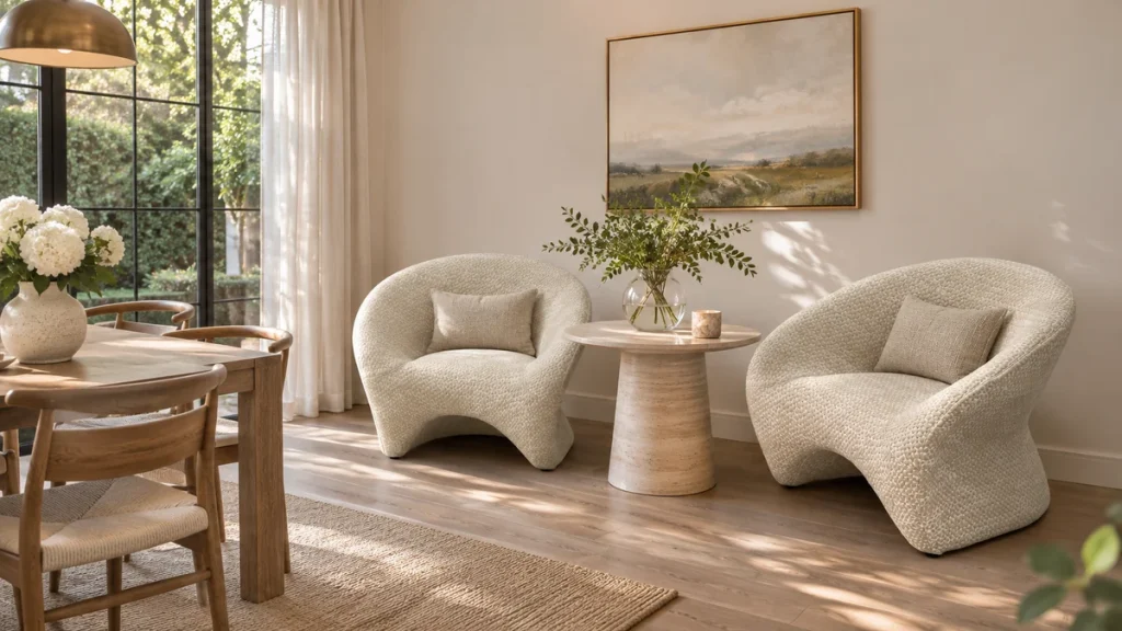
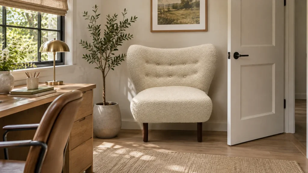
Warm cream lifts olive without creating the sharpness of optic white. It works especially well with natural wood, woven rugs and warm metal. A textured cream fabric also creates material contrast against smooth velvet or tightly woven green upholstery.
Choose the cream from the room, not from a paint fan alone. If walls are cool white, a very yellow chair can look dirty. If walls are warm, a blue-white chair may look disconnected. Aim for a related undertone with enough value difference from the sofa.
Households with pets, young children or heavy hospitality use should consider cleaning access and fabric performance. A speckled, looped or subtly patterned light textile hides minor variation better than a perfectly flat solid, but open loops may snag.
Camel, Tan and Cognac: An Earthy Material Story
Olive and tan share a natural warmth, so the pairing feels cohesive rather than decorative. Cognac leather can introduce patina and a smooth surface beside a fabric sofa. A tan woven chair keeps the room softer and can be easier to coordinate with existing wood.
Avoid matching the chair exactly to the floor. When tan leather, oak flooring and a beige rug sit at the same value, the chair can disappear. Use a darker frame, contrasting piping or a rug border to define it.
If the room already contains several brown woods, select one dominant temperature. Repeating a walnut tone in the chair legs or side table is usually enough; every wood does not need to match perfectly.
Rust and Terracotta: Warm Contrast Without Red
Rust sits opposite green more strongly than tan does, but its brown and orange content keeps the result grounded. It is effective when the olive sofa needs a clear companion rather than another neutral. Repeat rust once or twice in a small area such as artwork, a stripe in the rug or a ceramic object.
Control saturation. A bright orange chair may dominate a muted olive sofa, while a dusty terracotta usually feels balanced. North-facing rooms can benefit from the warmth; intense sun may make both colors appear stronger, so test them during the brightest period.
Ochre and Mustard: Related but More Energetic
Olive and ochre both contain yellow, which creates harmony. The challenge is preventing the room from becoming murky or overly autumnal. Add a clear light neutral and a small amount of dark definition through black, deep brown or charcoal.
A patterned mustard chair can work better than a large solid block because cream or dark lines break the color. Keep pattern scale different from the rug and curtains so the surfaces do not compete.
Dusty Blush and Muted Rose: A Softer Complement
Muted pink sits across from green in a gentle way. Dusty blush is less sugary than bright pink and pairs well with gray-olive upholstery, warm white walls and light woods. It is useful when the room needs softness without another beige piece.
Check the undertone carefully. A purple-pink can feel cold beside yellow olive, while a clay or peach-inflected blush usually connects more naturally. Repeat the pink sparingly; one chair and a small art detail may be enough.
Navy and Blue-Gray: A Cooler Counterpoint
Navy gives an olive sofa a more tailored character. It works best when there is enough light or a pale rug to prevent the seating area from becoming too dark. Muted blue-gray is quieter and suits grayer olives, but the pair can look flat if all surrounding surfaces are also cool and mid-tone.
Bridge the two colors with an element that contains both, such as patterned art, a rug or a cushion used sparingly. Avoid buying several “matching” blue accessories after choosing the chair; repetition should create continuity, not a theme.
Can a Green Accent Chair Work With a Green Sofa?
Yes, if the greens differ clearly in value, temperature or texture. A pale sage chair can sit beside a deep olive sofa, or a patterned green-and-cream chair can connect the seating while remaining distinct. Exact near-matches are risky because small color differences often look accidental.
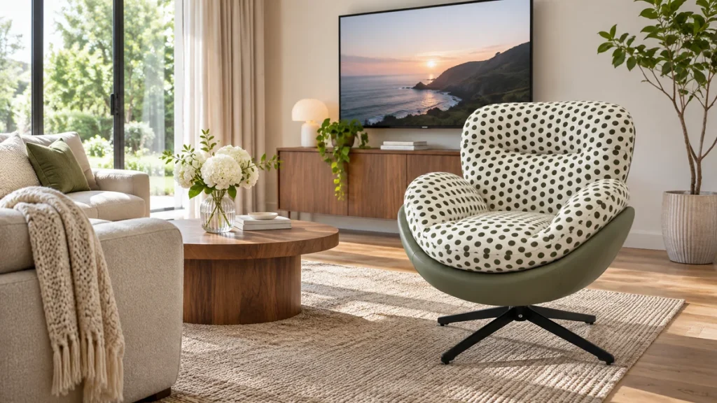
The mist green polka-dot swivel lounge chair demonstrates how a light ground, pattern and sculptural shape can create separation without leaving the green family. Use actual swatches to verify that the two greens do not clash.
Pattern Can Solve a Difficult Palette
A patterned chair can contain olive plus one or two room colors, making it a bridge rather than an isolated accent. Choose a dominant background that contrasts with the sofa and let smaller motifs repeat green. This avoids the visual weight of a second solid-color block.
Scale matters. A large botanical or geometric pattern creates a focal chair, while a small check or dot behaves more like texture. If the rug is highly patterned, choose a quieter chair or use a pattern with clearly different scale and ample negative space.
View the fabric over the approximate chair area. A tiny swatch can hide how frequently a motif repeats and where it will be cut at seams. For upholstery performance and pattern placement, see the chair upholstery fabric guide.
Material Contrast Is as Important as Color
| Olive sofa surface | Useful chair contrast | Watch for |
|---|---|---|
| Velvet | Leather, boucle or dry woven texture | Too many light-reactive plush surfaces |
| Flat woven fabric | Nubby boucle, leather or patterned weave | Similar textures making colors appear mismatched |
| Leather | Soft woven or upholstered shell | Competing leather tones without a bridge |
| Boucle | Tighter weave, smooth leather or visible wood | Excessive bulky texture in a small room |
Texture changes perceived color. Velvet appears lighter or darker as its pile turns, leather develops highlights and boucle creates small shadows. Evaluate material samples vertically and horizontally because light hits a chair back differently from a seat.
Coordinate the Rug Before Buying the Chair
The rug is often the largest colored surface after the sofa. Identify its background, dominant motif and smallest accent. A chair can repeat the small accent while contrasting with the sofa. If the rug already contains strong rust and navy, choose one for the chair and let the other remain secondary.
When the rug is neutral, the chair has more freedom, but check its value against the floor. Leave enough visual boundary around each piece. A chair that sits half on and half off a rug can look unstable; plan furniture placement and rug size together.
Consider the Chair’s Shape and Visual Weight
A large rounded chair in a saturated color has more impact than a slim exposed-frame chair in the same fabric. If the olive sofa is long, low and visually solid, an airy chair with visible legs can balance it. If the sofa has a light frame and open base, a fuller chair may give the arrangement an anchor.
Do not use color to compensate for wrong scale. Tape the chair’s footprint on the floor and mark its height against the wall. Maintain a comfortable walking path and make sure the chair can turn or recline without striking the sofa.
Browse our accent and lounge chair collection to compare silhouettes before narrowing the upholstery color.
Test the Combination in Real Light
- Photograph the sofa in daylight with no filter.
- Collect the rug, curtain, wall and wood samples that cannot easily change.
- Shortlist three chair color families, not ten nearly identical shades.
- Use the largest upholstery samples available and hold them vertically near the intended position.
- Check morning, afternoon and evening artificial light.
- View the samples from the room entrance and from the main seat.
- Make a grayscale photograph to confirm light-dark separation.
- Choose the material and performance grade only after the palette works.
Bulb temperature matters. Very warm lighting can push olive and cream toward yellow, while cool lighting can flatten tan and make gray-blue more prominent. Test under the lighting you actually use at night.
Common Pairing Mistakes
Buying an exact green online: A near-match often looks like an error. Choose deliberate contrast or verify physical samples from the same dye reference.
Ignoring the wall color: Cream, gray and beige walls alter every upholstery sample. Evaluate all large surfaces together.
Repeating the accent everywhere: The chair can be the main statement. Too many matching cushions and objects weaken its effect.
Choosing only by trend: The sofa and chair are expensive, long-lived pieces. Use trend colors in replaceable details unless the chair color genuinely suits the room.
Forgetting practical use: A pale chair may be visually ideal but unsuitable for a busy rental, pet household or dining-adjacent room. Select a cleanable textile or a forgiving pattern.
Final Buyer Checklist
- Exact olive undertone in physical daylight
- Chair value contrast in a grayscale check
- Relationship to walls, floor, rug and curtains
- One planned color bridge in art or textile
- Material contrast between sofa and chair
- Chair footprint, height and walking clearance
- Upholstery durability, care code and pattern repeat
- Daytime and nighttime sample approval
- Commercial fire or performance requirements where applicable
- Replacement fabric and batch documentation for project orders
For custom upholstery or coordinated project seating, send photographs, target colors, dimensions and quantity through our furniture project inquiry form.
Build a Three-Layer Color Plan
A controlled room palette is easier to manage when colors have clear jobs. Let the walls, floor and rug form the background layer; let the olive sofa and accent chair form the furniture layer; use art, cushions and objects as the adjustable detail layer. This prevents a small accessory from dictating an expensive chair purchase.
Choose the chair to relate to at least one fixed surface and one movable detail. For example, a cognac chair may repeat the floor’s warmth while connecting to a leather frame in the artwork. A cream chair may relate to the wall and pick up the rug background. The connection can be subtle; exact matching is unnecessary.
Limit the main palette before shopping. Photograph the fixed layer and carry physical samples when possible. A disciplined shortlist makes differences in undertone and texture easier to see than a screen filled with dozens of unrelated chairs.
Pairings for Common Wall Colors
Warm white walls
Cream, tan, rust and dusty blush usually sit comfortably against warm white. Keep enough contrast so a pale chair does not vanish. Navy can add definition when the room has ample daylight.
Cool white or pale gray walls
Blue-gray and controlled cream can bridge the wall to olive. Very yellow beige may appear dull unless warm wood or rust repeats it elsewhere. Test the chair close to the wall because cool reflected light changes upholstery.
Beige or greige walls
Cognac and olive can become too similar in value against beige. A lighter ivory chair or a stronger rust or navy focal color may create needed separation. Pattern is useful when it includes both the wall neutral and a darker accent.
Dark walls
Use a lighter chair or an open frame to keep the seating group legible. Dark navy can still work, but it needs a pale rug, metallic highlight or strong daylight to avoid becoming a single shadowed mass.
Wood and Metal Frame Finishes
Upholstery color is only part of the chair. Walnut and medium brown woods reinforce olive’s warmth. Pale oak lightens the composition. Black frames sharpen cream, mustard and patterned textiles, while aged brass adds warmth without another large color block.
Chrome and cool silver can work with grayer olive and blue-gray upholstery, but they may feel disconnected in a room dominated by warm woods. Repeat the metal once in lighting or a table detail. Avoid matching every metal; one dominant and one minor finish is usually more natural.
If sofa legs are visible, include them in the sample comparison. A beautiful chair fabric can still look wrong when its wood finish clashes with the sofa base at close range.
Seasonal Light Can Change Olive
Olive may look lively in summer daylight and browner during a dim winter afternoon. North-facing light often emphasizes gray and cool notes; warm west light can intensify yellow and rust. Artificial lighting adds another shift after sunset.
Keep samples for at least a day and move them through the exact chair position. Stand back at the room entrance. A color that works inches from the sofa may lose contrast from across the room. If the home changes dramatically by season, choose a stable chair neutral and express seasonal color through smaller textiles.
Open-Plan Rooms Need a Wider View
In an open living and dining area, the chair may be visible beside dining upholstery, kitchen cabinets and bar stools. List those colors before adding a strong accent. The chair can bridge zones by repeating a dining-chair wood finish or a small color from kitchen art.
Do not make every zone olive and rust simply because the sofa uses that palette. Repeat one element and allow another to change. For example, carry the chair’s black frame into dining lighting while keeping dining upholstery neutral.
View the proposed chair from all main approaches. A patterned back may be more visible than the seat, so ask for a rear elevation or fabric placement plan when the chair floats in the room.
Commercial and Hospitality Color Approval
Project buyers need a reproducible reference, not only a digital color name. Approve a physical fabric cutting under the destination lighting and record the supplier, collection, colorway and batch information. State which side and direction of the textile is the visual reference, particularly for velvet and directional patterns.
Check cleanability and replacement availability before finalizing a pale or highly specific accent. A chair used in a lobby may need to remain consistent across phased deliveries. Define an acceptable dye-lot range or require approval when a reorder is visibly different.
Create a small material board containing olive sofa fabric, chair fabric, primary wood, metal and rug. This becomes a practical inspection reference and helps prevent substitutions that are technically similar but visually incompatible.
How to Correct a Pairing That Feels Wrong
If the chair and sofa are too similar, place a contrasting side table or a rug boundary between them rather than immediately replacing upholstery. If the chair is too bright, repeat a small amount of its color in art and add a neutral cushion. If the room is too dark, improve lighting and increase the pale surface area around the seating group.
When undertones clash, accessories rarely solve the problem completely. Move the chair to another room or reupholster it in a deliberate contrast. Before making that investment, test a large draped fabric sample so the old color does not influence your judgment.
Correct one relationship at a time. Changing rug, curtains, cushions and wall art simultaneously makes it difficult to understand why the room improved or became less coherent.
Conclusion
Warm cream, tan, cognac, rust, ochre, dusty blush and navy can all work with an olive green sofa. Start with the sofa’s real undertone, then create deliberate value and material contrast. Let the rug and fixed finishes narrow the palette, test large samples in changing light and choose a chair whose scale and performance suit the room. A well-chosen accent chair should look connected without pretending to be part of a matching set.
FAQ
What is the safest accent chair color for an olive green sofa?
Warm cream or ivory is usually the safest because it lightens the seating group and works with common wood and rug tones. Match the cream’s undertone to the walls and test it against the sofa.
Does a brown chair go with an olive green sofa?
Yes. Camel, tan, cognac and chocolate create an earthy palette. Use value contrast so the chair remains visible against the floor and add a lighter neutral if the room becomes dark.
Can I use a blue accent chair with an olive sofa?
Navy and muted blue-gray can work, especially when blue repeats in a rug or artwork. Provide enough cream or light wood nearby so two dark seats do not overwhelm the room.
Should the accent chair match the sofa fabric?
No. Different textures usually make the pairing richer. Smooth leather, boucle, a dry weave or a controlled pattern can complement an olive sofa while keeping the two pieces distinct.
What color chair works with a dark olive sofa in a small room?
A warm cream, light tan or pale patterned chair with visible legs generally keeps the room brighter. Confirm that the footprint and back height preserve the walking path and sight line.