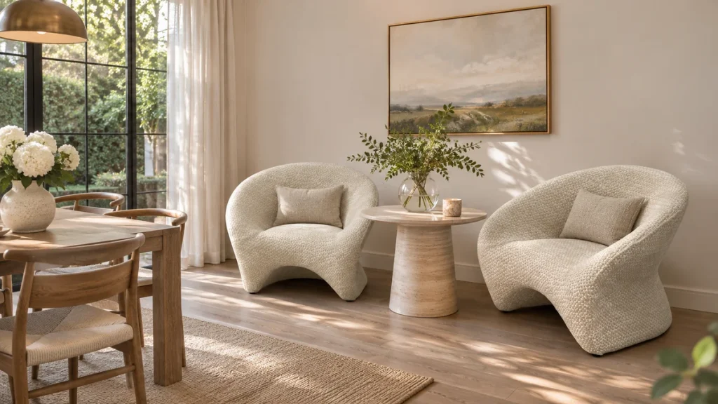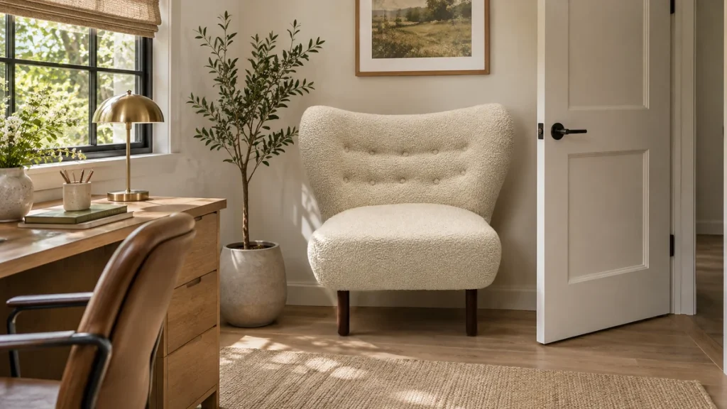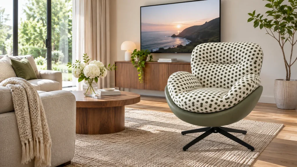
To photograph chair fabric colour accurately, light the fabric with a known, consistent source, place a neutral reference in the same frame, and lock your camera’s exposure and white balance before you shoot. If you let the camera decide colour automatically, or if you mix daylight with a warm room lamp, the file that leaves your studio will not match the roll of fabric that arrives at the buyer’s door. The goal is not a pretty image; it is a defensible one. A buyer should be able to hold their phone next to the delivered chair and see the same colour they approved on screen.
The decision boundary is simple. If your product is sold as a specific named colour or Pantone reference, you need a colour-managed workflow with a grey card and a fixed light source. If you are selling a “natural” or “oatmeal” fabric where slight variation is expected, you still need consistency, but you can accept a wider tolerance. The moment a buyer pays a premium for a defined shade, the photography has to be treated as part of the specification, not as marketing decoration.
This guide covers the lighting temperature problem, why fabric on a curved chair reads differently from fabric lying flat, and a studio setup you can build in a corner of a warehouse. It also covers the measurements and evidence to collect so that a colour dispute can be settled with data rather than opinion.
Why the same fabric looks different on a chair and flat on a table
Fabric is not a flat colour. It is a surface that scatters light in many directions, and the amount of scatter depends on the angle of the weave to the light and to the camera. When you photograph a swatch flat, the yarns sit in one plane. When the same fabric is stretched over a seat cushion, wrapped around an arm, and pulled into a seam, the yarns tilt. Some areas catch the light and read lighter; some fall into shadow and read darker. This is not a camera fault. It is how the material behaves.
The practical consequence is that a flat swatch photo and a chair photo of the same roll can differ by several visible steps in tone. A buyer who approved the flat swatch may open the box and see a chair that looks duller or more saturated. The fix is to show both, clearly labelled, and to explain which one represents the delivered product. For most seating, the chair photo is the honest one, because the buyer receives a shaped object, not a square of cloth.
Weave direction and pile change the reading
Velvet, chenille, and brushed cotton have a pile. Stroke the pile one way and it looks rich; stroke it the other way and it looks pale. On a chair, the pile on the seat usually runs in a different direction from the pile on the back. Under a single light, that difference can look like two different fabrics. Before you shoot, decide the pile direction for each panel and note it. If you cannot control it, shoot from the direction the buyer will most often view the chair, and say so in the caption.
Flat weaves such as linen, polyester blends, and tight bouclé are less dramatic but still shift. A linen with a visible slub will show more contrast under a hard light than under a soft one. If your studio uses a bare bulb, the slubs cast tiny shadows and the fabric looks rougher and darker than it does in a living room. Softening the light reduces this effect, but it also reduces the sparkle that some buyers expect. Neither is wrong; the mistake is not stating which look the photo represents.
Lighting temperature: the most common cause of colour complaints
Every light source has a colour temperature, measured in kelvin. Daylight at midday is around 5500K. A warm tungsten bulb is around 2700K. A cool white LED can be 4000K or 6500K. When you mix sources, the camera has to guess which one is white, and it usually guesses wrong. A chair shot under a window with a warm lamp on one side will show one arm golden and the other arm blue. The fabric did not change. The light did.
The reliable approach is to use one type of light for the whole frame, set the camera to that temperature manually, and keep it there for every shot in the set. Do not use auto white balance. Do not alternate between daylight and flash unless you are deliberately showing both and labelling them. Consistency across a product range matters more than absolute perfection in a single image.
Choosing a working colour temperature
For most residential and hospitality upholstery, 5000K to 5500K is a sensible working temperature. It is close to neutral daylight, so it does not flatter warm fabrics or cool down cool ones. If your showroom uses 3000K lighting, you may prefer to shoot at 3000K so the photo matches what a visitor sees in person. Either choice is defensible. What is not defensible is shooting at 3000K for one chair and 5500K for the next in the same collection.
Record the temperature in your file naming or metadata. A simple convention such as “chair-name_5500K_greycard” tells anyone reviewing the image what conditions produced it. If a buyer later claims the colour is off, you can compare their photo conditions with yours. This is the kind of evidence that turns a dispute into a conversation.
Using a grey card without turning every photo into a test chart
A grey card is a neutral reference that reflects all wavelengths equally. Place it in the frame, shoot it under the same light as the chair, and use it to set white balance in your editing software. The card does not need to fill the frame. A small patch in the corner, or a card held in front of the chair for one reference frame, is enough. The important thing is that the card receives the same light as the fabric.
If you cannot use a grey card, a white sheet of paper is a rough substitute, but many papers contain optical brighteners that make them slightly blue. A grey card is more reliable. For a low-cost studio, a pocket grey card and a single reference frame per lighting setup will solve most colour drift. You do not need a full colour checker unless you are matching a brand Pantone across multiple suppliers.
How to verify the grey card worked
After editing, open the reference frame and use your software’s colour picker on the grey card. The red, green, and blue values should be close to equal. If red is much higher, your image is still warm. If blue is higher, it is cool. Adjust the white balance until the values are within a few points of each other. Then apply that same adjustment to the chair frames shot under that light. This is a verifiable check, not a matter of taste.
For a more formal record, photograph the grey card beside the fabric swatch and beside the finished chair in the same session. If the swatch and the chair are shot under the same corrected light, any remaining difference is a material or shape effect, not a lighting error. That distinction is exactly what a sourcing team needs when a buyer complains.
Why fabric on a chair reads differently: shape, shadow, and scale
Use this relevant ChillSeatTrade chair as a product reference when checking shape, construction, and intended use.
A chair is a three-dimensional object. The seat is usually horizontal, the back is vertical or reclined, and the arms curve. Each surface receives light at a different angle. A fabric that looks even on a flat table will show a gradient across a seat cushion because the front edge is closer to the light than the back. This gradient is normal, but it can make the fabric look darker overall than the flat swatch.
Scale also matters. A tight weave photographed close up shows individual yarns and reads as a texture. The same weave photographed from two metres away blends into an average colour. Buyers often see the close-up first and expect that level of detail on the whole chair. If your product page shows only a macro shot, add a full-chair shot at a realistic viewing distance. The two images together set accurate expectations.
Seams, piping, and buttons create local colour shifts
Seams compress the fabric, so the colour at a seam can be slightly darker or lighter depending on how the light hits the fold. Piping in a contrast colour is a deliberate design choice, but self-piping can look like a shading error in a photo. Buttons and tufting create small shadows that read as darker spots. None of these are production faults. They are geometry.
When you photograph a tufted chair, light it from a higher angle so the shadows fall below the buttons rather than across them. This reduces the false contrast and keeps the fabric colour readable. If the tufting is deep, accept that some shadow is part of the design and note it. A buyer who understands that the shadows are intentional is less likely to report a colour defect.
A simple studio setup you can build in a corner
You do not need a professional studio. You need control. A corner with neutral grey walls, two softboxes or LED panels at 45 degrees, and a black or grey floor covering will handle most chair photography. The walls should not be brightly coloured, because coloured walls bounce coloured light onto the fabric. If your walls are painted, hang a neutral backdrop behind and beside the chair.
Place the chair so that the seat and back receive light from the same direction. Avoid placing a light directly above the chair, because it will create a hot spot on the seat and a dark shadow underneath. A light at 45 degrees to the left and another at 45 degrees to the right, both at the same height and power, gives even coverage. If you only have one light, use a large diffuser and a white reflector on the opposite side.
Camera settings that reduce colour error
Shoot in RAW if your camera supports it. RAW files retain more colour information and let you correct white balance without degrading the image. Set ISO to the lowest native value, usually 100 or 200, to reduce noise. Use an aperture around f/8 for the full chair so the seat and back are both sharp. Use a tripod so you can use a slower shutter speed without blur. Turn off any in-camera colour modes such as “vivid” or “landscape.”
Lock the white balance manually using the grey card or a custom preset. Do not leave it on auto. If your camera has a custom white balance function, use it. If not, set the kelvin value manually and keep it the same for the whole session. Check the histogram after the first shot to confirm the exposure is not clipping the highlights on light fabrics or crushing the shadows on dark ones.
Measurements and evidence to collect
Colour disputes are easier to resolve when you have numbers. Collect the colour temperature of your lights, the white balance setting, the ISO, the aperture, and the distance from camera to chair. If you use a colour checker, record the software’s reported colour error. If you do not, record the RGB values of the grey card after correction. These details show that your process was controlled.
Also record the fabric’s own reference data. Most mills provide a colour reference, a dye lot, and sometimes a spectrophotometer reading. If you have that data, compare it with the RGB values in your edited image. A close match does not prove the photo is perfect, but a large mismatch is a warning that your lighting or editing has shifted the colour. This is the evidence a sourcing team can present to a supplier or a buyer.
| Evidence item | How to collect it | Why it matters |
|---|---|---|
| Light colour temperature | Read the label on the LED panel or measure with a colour meter | Explains warm or cool casts that are not in the fabric |
| Grey card RGB after correction | Use the colour picker in editing software | Confirms white balance is neutral |
| Fabric dye lot reference | Request from the mill or supplier | Links the photo to a specific production batch |
| Camera distance and lens | Note it in the file metadata or a shot log | Helps reproduce the same framing and texture scale |
| Flat swatch and chair photo pair | Shoot both under the same corrected light | Shows the shape effect and sets honest expectations |
Material and construction choices that affect colour photography
Related baseline measurements are collected in the chair seat height guide.
Some fabrics are easier to photograph than others. A tight, matte weave in a mid-tone colour is the most forgiving. It reflects light evenly, hides small exposure errors, and does not change much with viewing angle. A high-sheen fabric, such as a satin or a glossy vinyl, is the hardest. It creates bright highlights and dark reflections that can look like colour variation even when the fabric is uniform.
If you are choosing a fabric for a product that will be sold online, consider how it will photograph as well as how it will wear. A bouclé with large loops creates texture and shadow, which can read as a darker colour in a photo. A flat chenille with a short pile is easier to light evenly. This does not mean you should avoid characterful fabrics. It means you should budget more time for lighting and editing when you use them.
Seat cushion construction and colour reading
A loose seat cushion with a piped edge shows more shadow lines than a tight seat. A tight seat with a single continuous surface reads more evenly. If your chair has a loose cushion, photograph it with the cushion sitting naturally, not compressed or tilted. A compressed cushion changes the angle of the fabric and can make the colour look different from the same cushion at rest.
For a fuller discussion of how upholstery type interacts with colour and wear, see this chair upholstery fabric guide. It covers weave structures and performance characteristics that also affect how a fabric reflects light. The photography implications are straightforward: the more texture and pile a fabric has, the more control you need over the light.
Step-by-step decision process for a repeatable colour photo
Follow the same sequence every time. Consistency is more valuable than any single setting. If you change the process between products, you create colour drift that buyers will notice across a collection.
- Choose one light type and one colour temperature for the session. Write it down.
- Set the camera to manual white balance at that temperature. Do not use auto.
- Place the grey card in the frame under the same light as the chair. Shoot one reference frame.
- Correct the reference frame until the grey card RGB values are close to equal.
- Apply that correction to all chair frames from the same session.
- Shoot a flat swatch of the same fabric under the same corrected light.
- Shoot the full chair from the buyer’s typical viewing distance.
- Shoot one close-up of the weave to show texture, clearly labelled as a close-up.
- Compare the edited chair colour with the flat swatch and with the mill reference. Note any difference.
- Save the settings as a preset for the next chair in the same fabric.
If you sell multiple chair models in the same fabric, shoot them in the same session or with the same preset. This prevents a buyer from seeing two chairs in the same fabric and wondering why one looks warmer. The answer should never be “the photographer changed the light.”
When to reshoot rather than edit
Editing can correct white balance and exposure, but it cannot recover information that was never captured. If the highlights on a light fabric are clipped to pure white, no adjustment will bring back the colour. If the shadows on a dark fabric are crushed to pure black, the texture is gone. In both cases, reshoot with a lower or higher exposure. A useful rule is to expose for the fabric, not for the background. The background can be adjusted separately.
If you are unsure whether a colour is accurate, compare the edited image with the physical fabric under the same light. Hold the fabric next to the screen. If the screen looks noticeably warmer or cooler, adjust the white balance and check again. This simple visual check catches most errors before the image is published.
Common mistakes and the limits of photography
Comfort criteria can be checked against the lounge chair dimensions.
The most common mistake is mixing light sources. A window and a lamp, or two lamps of different temperatures, will always create a colour cast that is difficult to correct. The second most common mistake is using auto white balance, which changes between frames and makes a set of photos look inconsistent. The third is editing on an uncalibrated monitor. If your screen is too warm, you will cool down every image to compensate, and the delivered fabric will look wrong to the buyer.
Calibrate your monitor regularly, or at least compare it with a known neutral reference. A monitor that is too bright can also mislead you, because a bright screen makes dark fabrics look lighter than they are. Set the screen brightness to a comfortable level and check the image on a second device, such as a phone or tablet, before publishing. Buyers often view product photos on phones, so a phone check is not optional.
What photography cannot fix
Photography cannot make a fabric look like a different fabric. If the mill sends a dye lot that is visibly different from the approved sample, no lighting setup will hide that from a buyer who has the physical chair. Photography can document the difference honestly, but it cannot resolve a production variation. The resolution belongs in the sourcing and quality-control process.
Photography also cannot compensate for a buyer’s screen settings. Two buyers viewing the same image on two phones may see two slightly different colours. This is why a grey card reference and a clear description of the fabric are important. The photo is one piece of evidence, not the entire specification. For a broader view of how fabric choice interacts with the finished product, browse the full product range and compare how different fabrics are presented.
| Mistake | Symptom in the photo | Correction |
|---|---|---|
| Mixed light sources | One side warm, one side cool | Use one light type and block window light |
| Auto white balance | Colour shifts between frames | Set manual white balance and keep it fixed |
| Uncalibrated monitor | Edits look neutral to you but wrong to others | Calibrate or check on multiple devices |
| Over-editing saturation | Fabric looks richer than the physical sample | Reduce saturation and compare with the fabric |
| Hard light on textured fabric | Exaggerated shadows and a darker overall read | Use a diffuser or softbox |
Home and project use cases
For a homeowner buying a single accent chair, the risk is lower but the disappointment is personal. A photo that shows the chair under warm evening light may look cosy online, but the fabric may appear grey in a north-facing living room. If you are buying for a specific room, ask for a photo taken under neutral light and compare it with your room’s light. A north-facing room is cooler; a south-facing room is warmer. The same fabric can read differently in each.
For an interior designer specifying multiple chairs for a hospitality project, the stakes are higher. A hotel lobby with 40 chairs in the same fabric needs a colour reference that survives different lighting conditions across the space. Ask the supplier for the grey card reference and the mill dye lot. If the supplier cannot provide them, treat the photo as indicative rather than contractual. This is a reasonable and common procurement position.
Hospitality and contract sourcing
In contract furniture, colour approval often goes through a sample chair or a physical swatch, not a photo. The photo is used for marketing and for internal reference. Even so, the photo should match the approved sample closely enough that a guest or client does not notice a discrepancy. If your marketing photo is warmer than the delivered chair, the guest may perceive a quality problem even when the fabric is correct.
For large orders, consider photographing the first production chair under the same controlled conditions as the approved sample. If the two photos match after grey card correction, you have visual evidence that the dye lot is consistent. If they do not, you have an early warning before the full order ships. This is a practical quality-control step that costs little and prevents expensive returns.
Buyer and sourcing checklist
Use this checklist before you publish a chair photo or approve a supplier’s image. Each item is a verify step, not a vague recommendation.
- Verify light source: One type of light, one colour temperature, no mixed window and lamp light.
- Verify white balance: Manual setting, grey card in frame, RGB values close to equal after correction.
- Verify exposure: No clipped highlights on light fabric, no crushed shadows on dark fabric.
- Verify flat swatch: Same fabric shot under the same corrected light, clearly labelled.
- Verify chair photo: Full chair from a realistic viewing distance, not only a close-up.
- Verify monitor: Calibrated or checked against a second device.
- Verify dye lot: Mill reference recorded and compared with the edited image.
- Verify consistency: Same preset used for all chairs in the same fabric.
- Verify description: Caption states the light temperature and that screens vary.
- Verify contact: A route for the buyer to request a physical swatch before ordering.
If any item fails, fix it before publishing. A single inconsistent photo in a collection can undermine trust in the whole range. Buyers notice when one chair looks different from the others, even if they cannot explain why.
Maintenance and verification after delivery
Colour accuracy does not end when the photo is published. After delivery, a buyer may compare the chair with the photo under their own lighting. If the chair looks different, the first question should be about light, not about production. Ask the buyer to photograph the chair next to a white sheet of paper under the same light. If the paper looks warm or cool, their light is the variable. If the paper looks neutral and the chair still looks wrong, then compare the dye lot and the production batch.
For ongoing maintenance, keep a physical swatch of each fabric in a neutral grey folder. Store it away from direct sunlight, because UV light can fade fabric over time. When you reshoot a product or approve a new batch, compare the new photo with the stored swatch under your standard studio light. This gives you a stable reference that does not depend on memory or on a screen.
If you need to verify a specific order or request a swatch, you can contact the team with the fabric name and order reference. A physical swatch is the most reliable way to confirm colour before a large commitment. For buyers who need to match a chair to an existing scheme, this step is worth the small delay.
Conclusion
Accurate chair fabric colour photography is a control problem, not a creative one. Use one light source at a known temperature, set white balance manually with a grey card, and keep the same settings across every chair in the same fabric. Show both a flat swatch and a full chair photo so buyers understand how shape and shadow affect the colour. Record the dye lot and the lighting conditions so a dispute can be settled with evidence. If you follow the checklist and compare the edited image with the physical fabric under the same light, you will reduce colour complaints that have nothing to do with production and everything to do with how the photo was made.
FAQ
Why does my chair fabric look different in photos than in person?
Lighting temperature is the usual cause. A photo taken under warm indoor light will look more golden than the same fabric under neutral daylight. Camera auto white balance can also shift the colour between shots. Using a grey card and a fixed light temperature will bring the photo closer to what you see in person.
Do I need a grey card, or can I use a white wall?
A grey card is more reliable because it reflects all colours evenly. A white wall may contain optical brighteners or a slight tint that misleads the camera. If you must use a wall, check it with a colour picker after editing. If the RGB values are not close to equal, the wall is not neutral enough.
Why does the same fabric look different on a flat swatch and on a chair?
A flat swatch sits in one plane, so the light hits it evenly. A chair has curves, seams, and pile direction changes, so some areas catch more light and some fall into shadow. This is normal. Show both images and label them so buyers know which one represents the delivered product.
What colour temperature should I use for furniture photography?
5000K to 5500K is a practical neutral range for most upholstery. If your showroom uses warmer light, you may choose 3000K to match the in-person experience. The important rule is to use the same temperature for every chair in the same collection so the images are consistent.
How can I check if my edited photo is accurate?
Hold the physical fabric next to your screen under the same light. If the screen looks noticeably warmer or cooler, adjust the white balance. You can also check the grey card RGB values in the edited file. They should be close to equal. A second check on a phone or tablet catches monitor-specific errors.
What should I do if the delivered chair colour does not match the photo?
First, photograph the chair next to a white sheet of paper under the same light. If the paper looks tinted, the lighting is the variable. If the paper looks neutral, compare the dye lot on the chair with the one in the photo. Request a physical swatch and contact the supplier with the order reference so the batch can be verified.