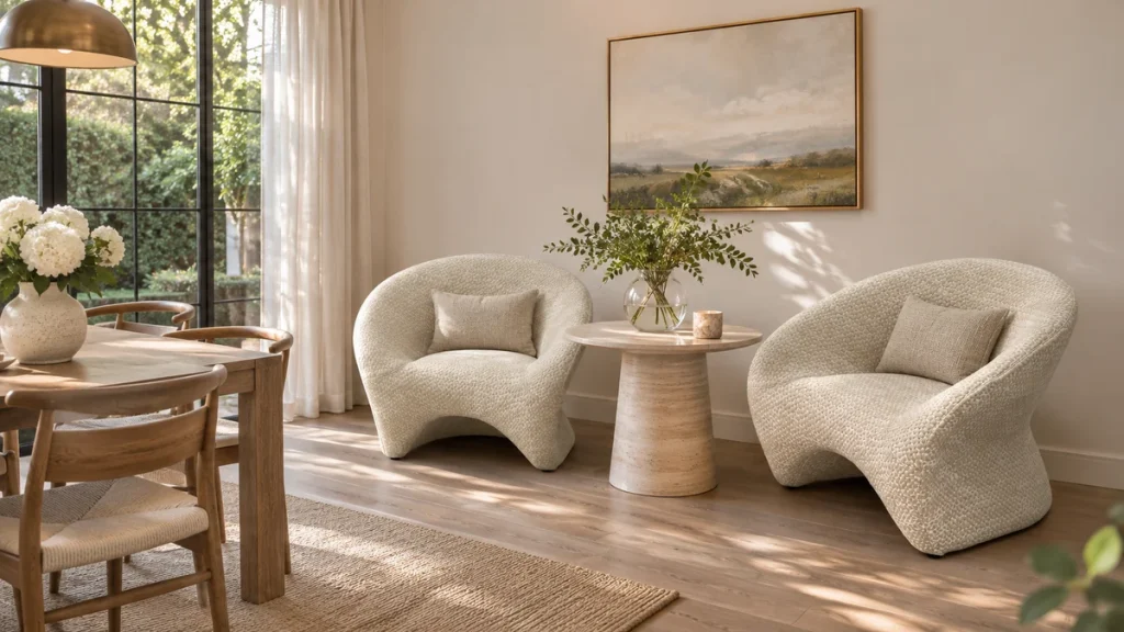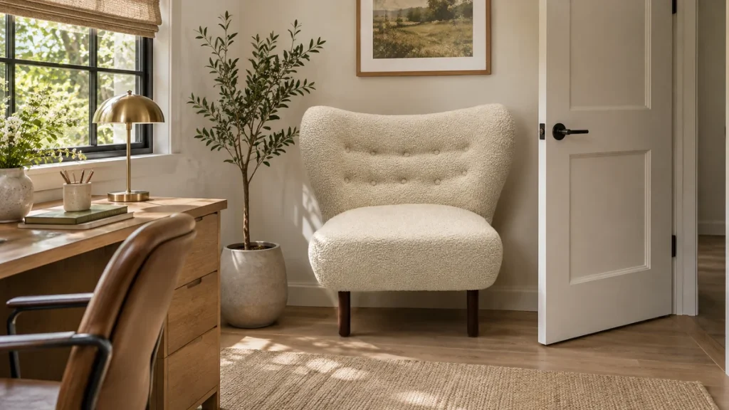
A dusty mauve sofa is a wonderfully nuanced centerpiece, but it can also be a tricky one to accessorize. The most practical answer is to start with a warm ivory or a deep charcoal accent chair, as these two anchors will always look intentional and allow you to build from there. If you want more vibrancy, a burnt ochre or a muted sage green will create a sophisticated contrast, while a burgundy or plum chair will only work if it is distinctly lighter or darker than your sofa, otherwise the two will merge into an indistinct blob.
The practical question behind “accent chair color for mauve sofa” is best answered with room measurements, construction details, and the chair’s intended use considered together.
Your success hinges on identifying the specific temperature of your mauve before you buy anything. A mauve with a pink, cool base behaves differently than one with a brown, warm base. Getting this wrong is the primary reason a chair looks “off” in a room, even when the color seems compatible on paper. This guide will walk you through diagnostic tests, specific color routes, finish coordination, and practical testing methods to ensure your new chair feels like a deliberate design choice rather than a lucky guess.
The Fastest Path: Neutral Foundations Before Bold Statements
If you want a definitive answer without deep analysis, choose a chair in a warm greige or a textured oatmeal. These colors act as a visual rest stop for the eye, allowing the mauve sofa to remain the focal point. For a more grounded, modern look, a charcoal or deep graphite chair provides a crisp, architectural edge that sharpens the softness of the dusty mauve. These neutrals are not boring; they are the canvas that makes the mauve look intentional.
Only after you have secured a neutral anchor should you consider a statement color. The most reliable statement partners are muted greens (sage, eucalyptus), earthy ochres, and certain denim blues. These sit opposite or adjacent to mauve on the color wheel, creating a tension that feels curated rather than chaotic. Avoid high-saturation brights like fire-engine red or electric purple, as they will fight with the dustiness of the sofa.
Diagnose the Undertone: Warm vs. Cool Mauve
Before you can pick a chair, you must know whether your mauve leans toward a rosy pink or a muddy brown. This is not about the paint swatch name; it is about the pigment ratio in the fabric. Place a piece of pure white paper next to the sofa cushion. Then, hold a piece of cream or beige paper next to it. Look at which paper makes the sofa look more vibrant and which makes it look dull.
If the mauve looks better against the pure white, it has a cooler, bluer undertone. If it looks better against the cream, it has a warmer, yellower undertone. A secondary test involves holding a true orange object (like a clementine) near the fabric. If the orange makes the sofa look pinker, the sofa is warm-leaning. If the orange makes the sofa look gray or muddy, the sofa is cool-leaning.
This distinction matters because a warm mauve can tolerate an ochre chair, while a cool mauve will clash with it. Conversely, a cool mauve pairs beautifully with a slate blue, while a warm mauve will turn that slate blue into a muddy green. Take a photo of your sofa with the test papers and view it on a neutral gray background on your phone to confirm your reading.
The “Grayscale” Verification Method
For a more scientific approach, download a grayscale filter app and take a photo of your sofa. Look at the gray value of the mauve. Is it a mid-gray, a dark gray, or a light gray? This tells you the value (lightness) of your sofa, which is critical for contrast. If your sofa is a medium-value mauve, you need a chair that is significantly lighter (ivory) or significantly darker (charcoal). If your sofa is a very light, airy mauve, a mid-tone ochre or green will provide the necessary contrast without being too harsh.
Safe and Sophisticated Neutral Chair Colors
Neutrals are not all created equal when placed against mauve. The wrong neutral, such as a cool gray, can make your sofa look dirty. The safest neutrals are those that contain a hint of the sofa’s own pigment or those that offer a strong tonal shift.
Warm Ivory and Undyed Linen
This is the most reliable choice for any mauve. The slight yellow in an ivory or undyed linen picks up the warmth in the mauve, creating a soft, sun-washed look. Avoid stark white, as it will make the mauve look more purple and potentially harsh. When selecting a chair, sit on the sample fabric first; linen will soften and fade over time, so ensure the original color is not too dark, or it may look washed out within a year. A linen chair also requires more maintenance, as it stains easily, so consider a performance fabric that mimics the linen texture if this is for a high-traffic family room.
Charcoal and Deep Greige
If you want a grounding effect, charcoal is your best friend. It is the only dark neutral that does not introduce a competing color temperature. A deep greige (a mix of gray and beige) works well if it has a distinct brown base rather than a green one. These dark chairs anchor the space and make the mauve sofa appear lighter and more delicate. They are also practical for homes with pets or children, as they hide wear effectively. Ensure the charcoal does not have a blue tint, as that can clash with the red base of the mauve.
Mushroom and Taupe
These mid-tone neutrals are a riskier choice because they sit in the same value range as many mauves. If your sofa is a medium dusty mauve, a mushroom chair may disappear into it. However, if your sofa is quite light, a deeper taupe can work as a subtle tonal layering effect. The key is to ensure the taupe is clearly browner than the sofa. If there is any doubt, choose a lighter ivory or a darker charcoal instead.
Green, Ochre, and Blue: The Three Reliable Contrasts
When you are ready for color, these three families offer the highest success rate with dusty mauve. They work because they share a muted, dusty quality that prevents them from looking like primary colors.
Sage and Eucalyptus Green
Green is the most versatile contrast for mauve. The key is to select a green that has a gray or yellow base, not a blue base. A sage green with a hint of yellow will bring out the pink in the mauve beautifully. A eucalyptus green, which has a slight gray tint, will calm the sofa down and create a spa-like atmosphere. Avoid emerald or forest greens, as they are too saturated and will make the mauve look faded. When selecting a green chair, look at the fabric in natural daylight; some greens shift dramatically toward blue under artificial light.
Burnt Ochre and Mustard
This is a bold but rewarding choice for warm mauves. The yellow-orange in ochre is the direct complement to the purple in mauve, creating a vibrant but grounded contrast. It is essential that the ochre is “burnt” (meaning it has a brown undertone) rather than a bright lemon yellow. Mustard works similarly, but it must be deep and spicy, not acidic. This combination is excellent for a bohemian or mid-century modern aesthetic. If your mauve is cool-toned, skip this option entirely, as it will create a jarring clash.
Denim and Slate Blue
Blue works best with cool mauves. The goal is to find a blue that is dusty, like a faded denim or a slate gray-blue. This creates a analogous, calming palette. Avoid navy, which can be too heavy, and avoid bright cobalt, which will be jarring. A denim blue chair in a textured cotton or chenille can add a casual, lived-in feel. For a cool mauve, this is your most reliable color contrast. If your mauve is warm, a blue chair will look disconnected from the sofa, so stick to green instead.
When Burgundy or Plum Gets Too Close
Use this relevant ChillSeatTrade chair as a product reference when checking shape, construction, and intended use.
It is tempting to pair a mauve sofa with a deeper plum or burgundy chair, assuming they belong to the same family. In practice, this often fails because the two colors fight for dominance without offering any contrast. If the burgundy is too close in value to the mauve, the eye cannot separate the sofa from the chair, resulting in a confusing, muddy silhouette.
If you love the idea of a red-family chair, you must create a distinct separation. Choose a burgundy that is significantly darker—almost wine-colored—and pair it with a sofa in a light, airy mauve. Alternatively, if your sofa is dark, choose a chair in a much lighter pink or blush. Another option is to use a burgundy chair with a distinctly different texture, such as a high-pile velvet versus a flat weave sofa. The texture difference can sometimes be enough to delineate the shapes, but this is a risky move for a novice decorator.
If you decide to go this route, consider a chair with a distinct silhouette, such as a wingback or a barrel chair. The shape difference will help separate the two similar colors. However, for most rooms, a green or ochre chair will offer a more successful and dynamic pairing than a plum or burgundy one.
Coordinate Wood and Metal Finishes
The frame and legs of your accent chair are as important as the upholstery. The metal or wood finish on the chair legs must relate to the other hardware in the room, such as the sofa legs, coffee table, and lighting fixtures. You are not trying to match them exactly, but you are trying to coordinate them within a temperature family.
If your mauve sofa has warm oak or walnut legs, your accent chair should have a similar wood tone. A black metal chair leg can work with warm wood if the room has other black accents, but it should not be the only black element. For a cool mauve with a gray undertone, brushed brass or matte black metal legs are excellent choices. Chrome and nickel finishes can work, but they must be echoed in the room to avoid looking sterile.
Here is a practical guide to finish coordination:
| Sofa Base Finish | Recommended Chair Leg Finish | Finishes to Avoid |
|---|---|---|
| Light Oak / Natural Wood | Light oak, bamboo, or matte black metal | Dark walnut, polished brass |
| Dark Walnut / Ebony | Dark walnut, brushed brass, matte black | Light oak, silver/chrome |
| Black Metal | Matte black, gunmetal, or dark bronze | Bright brass, polished chrome |
| Brass / Gold Metal | Brushed brass, antique gold, or light wood | Silver, chrome, or cool gray wood tones |
When you are looking at a chair with an exposed frame, measure the leg height against your sofa. If the chair leg is significantly shorter, it will look like a child’s piece. Ideally, the seat height of the chair should be within an inch or two of your sofa’s seat height for visual continuity. Check the seat height guide for specific measurements to ensure your chair does not sit too high or too low relative to the sofa.
Pattern and Texture: The Visual Bridge
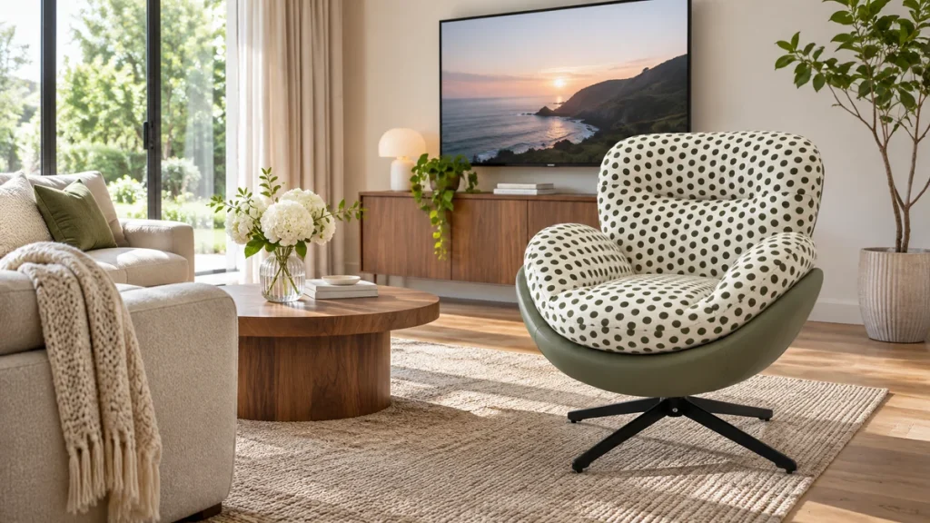
When you have a solid mauve sofa, the accent chair is the perfect place to introduce pattern or a contrasting texture. A plain chair in a smooth cotton can sometimes feel flat. A chair in a textured bouclé, a ribbed velvet, or a woven tweed adds depth to the room. The texture interacts with the light and gives the eye something to explore.
If you choose a neutral chair color, consider a patterned fabric with a subtle geometric design that includes a hint of the mauve. This ties the two pieces together without being literal. For a colorful chair, keep the pattern simple—a solid texture is usually safer. The texture should contrast with the sofa. If your sofa is a smooth, tight-weave fabric, choose a chair in a nubby or fluffy fabric. If your sofa is a plush velvet, choose a chair in a flat, crisp cotton or linen.
Consider the maintenance of these textures. A bouclé chair is beautiful but can snag easily if you have pets. A velvet chair shows dust and compression marks. A performance velvet is a better option for a family room, as it is more durable and easier to clean. For a formal living room, a silk-blend or a high-quality linen adds a level of sophistication. Always check the fabric’s rub count (Martindale) for durability; a count of 30,000 or higher is suitable for residential use, while 50,000+ is ideal for high-traffic areas or hospitality settings.
Daylight and Lamp-Light Testing: See It Before You Buy
For a different motion and support profile, consult the lounge chair and recliner comparison.
Color perception changes dramatically between daylight and artificial light. A sage green that looks perfect in the showroom at noon may look like a drab olive under your evening lamps. You must test your fabric samples in the actual room where the chair will live. Do not rely on your phone screen or a small swatch held under a single light bulb.
Request a large sample (at least 12 inches by 12 inches) from the manufacturer. Place it vertically against the sofa cushion and lean it where the chair will go. Observe it at three times of day: morning daylight, midday sun, and evening lamp light. In the morning, cool daylight will emphasize any blue undertones. In the evening, incandescent or warm LED light will emphasize yellow and red undertones. If the chair fabric looks good at all three times, it is a safe choice.
Pay special attention to the direction of the fabric’s nap. Velvet and chenille have a nap that reflects light differently depending on the viewing angle. If you place the chair facing the window, the velvet will look lighter; if it faces away, it will look darker. This can alter the perceived color by several shades. Use a lounge chair dimensions guide to ensure the physical size of the chair does not overwhelm the space, but also use the same method to consider how the bulk of the chair will shadow the sofa.
Lighting Temperature Quick Reference
| Lighting Type | Effect on Mauve Sofa | Best Chair Colors to Test |
|---|---|---|
| Cool Daylight (North-facing window) | Enhances purple, makes sofa look cooler | Warm ivory, burnt ochre, yellow-based sage |
| Warm Incandescent / Halogen | Enhances pink/red, makes sofa look warmer | Charcoal, slate blue, cool gray-greens |
| LED (4000K-5000K) | Neutral, accurate color rendering | All colors can be assessed accurately |
When you test, do not just look at the color. Sit in the chair and look at the sofa from the chair’s perspective. Does the combination feel harmonious? You should also test the comfort level of the chair thoroughly. A chair that looks perfect but is not comfortable will be a wasted purchase. Read reviews on the comfort characteristics of lounge chairs to understand seat depth and back support before you commit.
Curated Palettes for Light and Dark Rooms
The ambient light level of your room should dictate the overall contrast of your palette. A dark, moody room requires a different approach than a bright, sun-drenched space.
Palettes for a Bright, Light-Filled Room
In a room with abundant natural light, you have the freedom to use deeper, more saturated chair colors without making the space feel heavy. The light will bounce off the mauve and the chair, keeping the room airy. Consider these combinations:
- The Fresh Pair: Dusty mauve sofa + Sage green chair in a light linen. Add white oak wood accents.
- The Sunlit Contrast: Dusty mauve sofa + Burnt ochre chair in a textured chenille. Add brass or gold metal accents.
- The Cool Retreat: Dusty mauve sofa + Slate blue chair in a smooth velvet. Add chrome or nickel accents.
In bright rooms, you can also mix patterns more freely. A floral or ikat pattern on the chair can work if it contains a mauve that matches the sofa. The key is to ensure the background of the pattern is light, so it does not create a dark hole in the bright room.
Palettes for a Dark, Moody Room
In a room with limited natural light, you must be careful not to let the furniture disappear into the shadows. A dark mauve sofa in a dark room needs a chair that will catch the light and provide a focal point. Avoid dark charcoal or deep burgundy, as they will be invisible. Instead, choose lighter, reflective fabrics:
- The Glow: Dusty mauve sofa + Ivory bouclé chair. The texture will catch the light and visually expand the room.
- The Jewel Box: Dusty mauve sofa + Eucalyptus green velvet chair. The velvet will reflect any available light, adding richness without darkening the space.
- The Light Anchor: Dusty mauve sofa + Light greige chair in a smooth cotton. This adds a subtle contrast without introducing a jarring color.
In a dark room, consider adding a floor lamp behind the accent chair to create a halo of light that separates the chair from the wall and the sofa. This is a design trick that makes the chair appear lighter and more defined. Also, ensure the chair frame is a light wood or brass, as dark legs will disappear against a dark floor.
Chair Style and Scale: Matching the Sofa’s Personality
Color is only half the equation. The style of the chair must complement the sofa’s form. A sleek, mid-century modern sofa needs a chair with clean lines and tapered legs. A traditional, rolled-arm sofa needs a wingback or a club chair. If you mix styles, do so with intention—a modern chair can look great with a traditional sofa if they share a similar scale and color temperature.
Pay close attention to the seat height. A chair that is too low will be difficult for older guests to use, while a chair that is too high will feel like a barstool. The standard seat height for a lounge chair is between 17 and 19 inches. Measure your sofa’s seat height and try to keep the chair within this range. If the chair is significantly lower, it will feel like a child’s seat. The depth of the seat is also crucial. A chair that is too shallow will not support tall people, while a chair that is too deep will be uncomfortable for shorter guests. Review the standard seat height parameters to ensure your purchase is ergonomically sound for your household.
Consider the visual weight of the chair. A bulky, overstuffed chair next to a delicate, slim-armed sofa will look unbalanced. If your sofa is low and long, choose a chair that is tall and narrow to create a vertical line. If your sofa is high-backed, choose a chair with a lower profile to avoid a wall of fabric. The goal is to create a conversational grouping where the two pieces feel like they are in dialogue, not competition.
Palette Table: Quick Reference for Your Room
To help you make a final decision, use this summary table. It consolidates the undertone of your mauve, the recommended chair colors, and the expected effect.
| Sofa Undertone | Best Chair Color Choices | Visual Effect | Recommended Fabric Finish |
|---|---|---|---|
| Warm (brown/yellow base) | Ivory, Burnt Ochre, Sage Green, Mushroom | Sun-washed, cohesive, earthy | Matte cotton, textured linen, wool tweed |
| Cool (pink/blue base) | Charcoal, Slate Blue, Eucalyptus, Greige | Crisp, calming, modern | Smooth velvet, performance chenille, bouclé |
| Undetermined / Neutral | Warm Ivory, Deep Charcoal, Denim Blue | Safe, balanced, versatile | Any texture; avoid high-sheen fabrics |
If you are sourcing for a hospitality project or a waiting area, consider the durability of the fabric in this table. Commercial spaces require a higher Martindale rub count and often require flame-retardant treatments. For a hotel lobby, a dark charcoal or a slate blue in a high-performance fabric will hide wear and resist stains better than a light ivory. For a residential setting, you have more freedom to choose a delicate fabric, but you should still consider the cleaning method. Check if the chair cover is removable and washable, or if it requires professional cleaning. A chair with a tight back and a removable seat cushion is easier to maintain than one with a fully upholstered, non-removable cover.
Selection Checklist: Verify Before You Commit
Before you finalize your purchase, run through this checklist to ensure you have covered all the practical and aesthetic bases. This is a pass/fail verification, not a preference survey.
| Checklist Item | Pass Condition | Fail Condition |
|---|---|---|
| Undertone Identification | I have confirmed warm vs. cool using the white/cream paper test. | I am guessing based on the paint name or memory. |
| Color Value Contrast | The chair is clearly lighter or darker than the sofa in a grayscale photo. | The chair and sofa are the same lightness; they will blend together. |
| Finish Coordination | Chair legs match the temperature of the sofa base and room hardware. | Chair legs introduce a new, isolated metal or wood tone. |
| Fabric Texture Relation | Chair texture differs from sofa texture (e.g., smooth vs. nubby). | Chair and sofa are both smooth velvet or both flat cotton; no visual separation. |
| Lighting Test | Large fabric sample looks good at morning, noon, and evening light. | Fabric looks great in the store but muddy or gray in my living room. |
| Seat Height Compatibility | Chair seat height is within 1-2 inches of the sofa seat height. | Chair is significantly lower or higher, creating an awkward viewing line. |
| Room Function | Fabric durability (rub count) matches the traffic level of the room. | I am buying a delicate fabric for a high-traffic family room or rental unit. |
If you fail any of these checks, do not buy the chair. It is better to wait for a different fabric or a different chair model than to force a square peg into a round hole. If you are purchasing for a commercial or hospitality setting, you must also verify the chair meets local fire safety regulations for upholstered furniture. Contact your supplier to confirm the foam and fabric ratings. For any specific questions about a chair you are considering, you can contact the supplier directly to ask about custom fabric options or dimension modifications.
Conclusion
Pairing an accent chair with a dusty mauve sofa is a matter of disciplined color theory and practical observation. Start by identifying whether your mauve leans warm or cool, then choose a route: a grounding neutral for safety, or a sage, ochre, or slate blue for a curated contrast. The most common mistake is selecting a chair that is too close in value to the sofa, which erases the visual separation between the two pieces. Always test large fabric samples in your actual lighting conditions and verify that the chair’s seat height and finish align with your existing furniture. By following the checklist, you can confidently select a chair that enhances your mauve sofa rather than competing with it, ensuring a cohesive and intentional living space.
FAQ
What if my mauve sofa is very dark and almost looks like a plum?
If your sofa is dark, treat it as a neutral dark base. You have more freedom to choose a lighter, brighter chair. A light ivory or a bright sage green will create a striking contrast. Avoid dark charcoal or dark green, as they will disappear into the sofa. The key is to introduce light and texture to prevent the room from feeling like a cave.
Can I use a patterned chair with a mauve sofa?
Yes, but only if the pattern contains a color that is clearly lighter or darker than the sofa’s background. A pattern with a white or cream background and a small mauve accent will work well. Avoid patterns that are predominantly mauve or plum, as they will blend with the sofa. The pattern should serve as a textural contrast, not a color match.
What type of fabric is easiest to maintain for an accent chair?
Performance fabrics treated with a stain-resistant finish, such as those containing olefin or solution-dyed acrylic, are the easiest to maintain. They resist fading and are easier to clean with a mild soap and water solution. For a residential living room, a high-quality microfiber or a tightly woven cotton with a stain guard is a practical choice. Avoid raw linen and silk, which stain easily and require professional cleaning.
Should the accent chair match the sofa legs?
They do not need to match exactly, but they must coordinate within the same finish family. If your sofa has black metal legs, the chair should have black or dark bronze legs. Mixing wood tones is acceptable if they are both warm