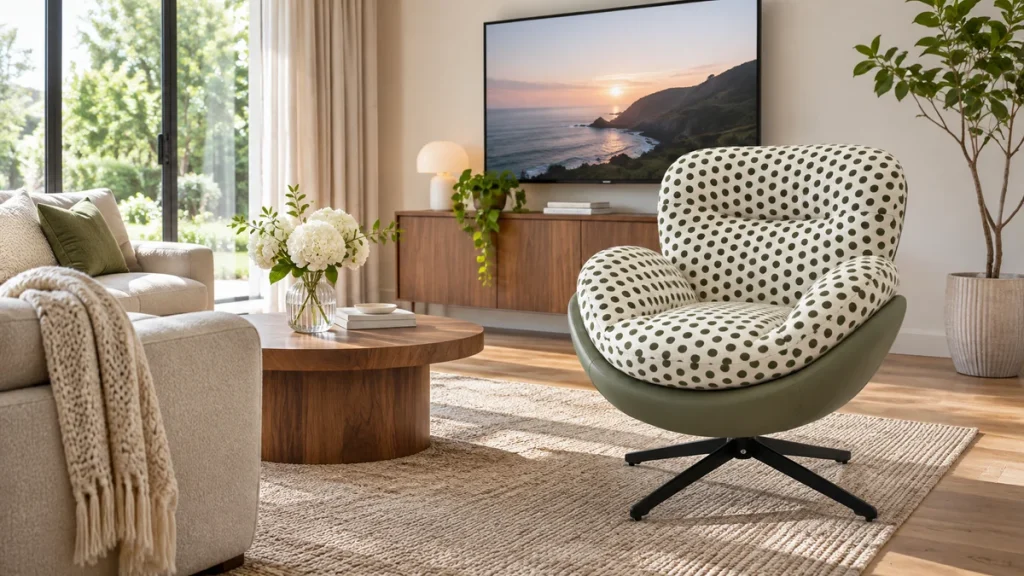
Pairing a patterned accent chair with a patterned rug can produce one of the most visually rich corners in a room, but it can also create a chaotic clash that makes both pieces look like mistakes. The practical answer is that you can absolutely combine these two elements successfully if you control four variables: pattern scale, color repetition, visual rest, and motif direction. In short, you want one pattern to clearly lead, the second to support, and a solid or tonal element nearby to give the eye a place to land. This is not about matching patterns; it is about engineering a relationship between them so that the room feels curated, not accidental.
The practical question behind “patterned accent chair with patterned rug” is best answered with room measurements, construction details, and the chair’s intended use considered together.
Before you buy either piece, you need a strategy. The most common failure is purchasing a chair and a rug separately that each look great alone, then discovering that their patterns compete at the same visual volume. The fix is to decide which piece is the hero before you commit to the other. If you already own the rug, the chair should defer to it. If you have the chair, the rug should be selected as its supporting cast. This article gives you a concrete method for making that call, with specific rules about scale, color counts, spacing, and light that you can apply regardless of whether you are styling a London flat, a Dubai hotel lounge, or a sourcing order for a hospitality project.
You also need to understand that pattern pairing is not subjective in the way that many people assume. There are measurable reasons why certain combinations work. A large floral rug with a small geometric chair can feel balanced because the eye reads the difference in scale as intentional hierarchy. A rug with a busy all-over motif and a chair with a bold stripe at the same scale will likely vibrate against each other. The guidance below walks you through each decision point, including how far the rug should extend beyond the chair, how to test fabric and fiber samples in real light, and which combinations to avoid entirely.
Choose One Dominant Pattern Before You Choose the Second
The single most effective rule for combining a patterned accent chair with a patterned rug is to assign one pattern the role of primary and the other the role of secondary. This is not about making one pattern barely visible; it is about ensuring that a viewer can immediately identify which pattern anchors the space. When both patterns demand equal attention, the eye has no hierarchy to follow, and the result reads as noise.
If the rug is the dominant pattern, it should be the larger, more colorful, or more complex of the two. The chair then carries a pattern that is simpler, smaller in scale, or lower in contrast. For example, a rug with a sprawling overscaled botanical print in rust, ochre, and deep green can be paired with a chair in a small-scale ticking stripe that picks up only the rust color. The rug tells the story; the chair confirms the palette. Conversely, if the chair is the hero—perhaps a striking ikat or a vivid flame stitch—the rug should be muted. Choose a rug with a subtle tone-on-tone texture, a low-contrast geometric, or a pattern that reads as a solid from a distance of two meters.
To make this decision concrete, evaluate the visual weight of each pattern. Visual weight is determined by contrast, not by color intensity alone. A black-and-white geometric pattern has high visual weight even if it is small. A pastel floral has low visual weight even if the shapes are large. Your dominant pattern should have roughly 60 to 70 percent of the visual weight in the pairing. The supporting pattern should hold the remaining 30 to 40 percent. If you cannot quickly determine which pattern is heavier, place samples side by side on the floor and step back three meters. The one your eye lands on first is the dominant pattern. If your eye bounces between them, you do not yet have a hierarchy, and you need to adjust one of the two before proceeding.
Vary Pattern Scale So the Eye Can Sort the Layers
Pattern scale is the distance between repeated motifs, measured from the same point on one motif to the same point on the next. When two patterns have similar scale, the brain struggles to separate them into foreground and background. When scales differ significantly, the brain can categorize one as large structure and the other as fine detail, which creates a comfortable layered effect.
Aim for a scale ratio of at least 1:3 between the two patterns. If the rug has a motif that repeats every 30 centimeters, the chair pattern should repeat at roughly 10 centimeters or less. Alternatively, you can reverse this: a chair with a 40-centimeter repeat can sit on a rug with a 10-centimeter micro-pattern. What you want to avoid is a chair with a 20-centimeter repeat and a rug with a 25-centimeter repeat. That near-match creates an optical vibration because the eye cannot decide which scale is leading.
For practical measurement, look at the pattern repeat specifications if you are buying online. Many rug listings include the pattern repeat in the technical details. For upholstery fabric, the repeat is usually listed in centimeters or inches on the product page. If you are looking at physical samples, measure from the center of one motif to the center of the next identical motif. For a floral, that means measuring from the center of one flower to the center of the next flower of the same size. For a stripe, measure the full width of one stripe cycle, including the contrasting ground.
When you cannot find a repeat measurement, use the 60/30 rule of thumb. Stand about 2.5 meters away from the pieces. If the rug pattern appears to be about the size of your palm when viewed at that distance, and the chair pattern appears to be about the size of your thumbnail, the scale difference is likely sufficient. If both appear to be the same size relative to your hand, the scales are too close.
Repeat Two Colors and Leave One Independent
Color repetition is the bridge that connects two different patterns. Without shared colors, even perfectly scaled patterns will feel disconnected. The rule here is simple: two colors must repeat between the chair and the rug, and one color in the pairing may be independent. This gives you enough connection to create cohesion while preserving enough variety to keep the pairing from looking like a matched set.
Identify the two colors that will repeat. These should be the most prominent colors in your dominant pattern. For example, if your rug has a cream ground with navy and terracotta motifs, your chair should include navy and terracotta in its pattern or ground. The chair may also include a third color, such as olive green, that does not appear in the rug. That independent color adds depth without creating a demand for a third point of connection.
Be careful with the background colors. The ground of the rug and the ground of the chair fabric should either match or be closely related in tone. If the rug is cream and the chair is bright white, the difference will be noticeable and can create a disjointed look. If the rug is cream and the chair is a warm oatmeal, the tones will harmonize. Similarly, if both grounds are dark, such as charcoal and espresso, they will read as a continuous dark plane that lets the patterns float on top.
A useful diagnostic is to photograph both pieces together and then convert the image to grayscale. In grayscale, you can see whether the value structure is balanced. You want the dominant pattern to have a wider range of light-to-dark contrast than the supporting pattern. If both patterns show the same level of contrast in grayscale, the color repetition will not be enough to save the pairing. One pattern needs to be softened or simplified.
Create Visual Rest with a Solid or Tonal Element
Even a perfectly scaled and colored pattern pairing can exhaust the eye if there is no place to rest. Visual rest does not mean you need a plain wall or an empty floor. It means that within the immediate composition, there should be a solid surface that interrupts the patterns and gives the eye a neutral zone. This is often a side table, an ottoman, a throw pillow, or a section of wall between the chair and the rug edge.
The most effective placement for visual rest is between the chair back and the rug pattern. If the chair sits entirely on the rug with its back against a patterned wall, you have pattern layered on pattern with no break. Instead, position the chair so that there is at least 20 to 30 centimeters of solid floor or a solid piece of furniture between the chair silhouette and the next patterned surface. If the chair is against a wall, that wall should be solid or very subtly textured, not wallpapered with a competing motif.
You can also create visual rest through the chair itself. If the chair has a patterned seat and back, add a solid-colored lumbar pillow in one of the repeating colors. If the chair has patterned arms but a solid back, use that solid back as the rest point. If the rug is the dominant pattern, place a solid or low-texture coffee table or ottoman in front of the chair to break up the field of pattern on the floor.
Another practical method is to use the chair’s frame. A chair with visible solid wood legs or arms provides a visual pause between the seat pattern and the floor pattern. The more wood or solid material that separates the two patterned surfaces, the easier the pairing will be to live with. If your chair is fully upholstered with no exposed frame, consider adding a solid skirt or a separate solid floor cushion beneath it to create that separation.
Consider Pattern Direction and How It Affects the Eye’s Path
Project buyers can contact the furniture sourcing team for dimensions, material options, and order-specific questions.
Pattern direction refers to the orientation of the motifs—whether they run vertically, horizontally, diagonally, or in a scattered all-over arrangement. When you combine a patterned chair with a patterned rug, the direction of each pattern determines how the eye travels across the space. Directional conflict is one of the least understood but most impactful causes of visual discomfort.
As a general rule, avoid placing a strong vertical pattern on the chair directly over a strong horizontal pattern on the rug. The perpendicular clash creates a visual gridlock. Instead, pair a vertical chair pattern with a rug that has a scattered or organic motif with no dominant axis. Similarly, a rug with strong horizontal stripes should be paired with a chair that has a non-directional pattern, such as a small all-over geometric or a random floral.
Diagonal patterns require special care. A chair with a bold diagonal stripe or a chevron pattern will fight with almost any directional rug because the diagonal axis creates a dynamic tension that is hard to neutralize. If you love a diagonal chair pattern, choose a rug with a completely non-directional motif, such as a flat-weave with a small repeating diamond or a distressed Persian-style pattern that has no obvious orientation.
Motif direction also matters for the way the chair faces. If the rug has a central medallion or a directional design that leads the eye toward a focal point, position the chair so that its pattern does not interrupt that flow. For example, a rug with a medallion in the center should not have a chair with a large-scale pattern sitting directly on the medallion, because the two focal points will compete. Instead, place the chair at the edge of the rug so that the medallion remains visible and the chair pattern reads as a separate layer.
For materials that have a pile direction, such as cut-pile rugs or velvet upholstery, the light reflection will also affect how the pattern reads. A cut-pile rug with a carved pattern will show the pattern differently depending on the angle of light and the direction of the pile. When you place a patterned chair on a patterned rug, check how the light falls across both surfaces at different times of day. A pattern that looks subtle in midday sun can become harsh under evening lamplight.
Use Distance and Rug Boundaries to Separate the Patterns
The physical distance between the chair and the rug pattern is a tool that many people overlook. You do not have to place the chair directly on the rug. In fact, for a patterned chair and a patterned rug, a small separation can be the most elegant solution. The eye needs a boundary to understand where one pattern ends and the other begins.
If the rug is large enough, place the chair so that only its front legs rest on the rug, leaving the back legs on the floor. This creates a visible line of demarcation between the two surfaces. The rug pattern then reads as a foreground element beneath the front of the chair, while the floor provides a neutral break behind. This works especially well when the floor is a solid wood, tile, or concrete in a tone that appears in both patterns.
If the chair must sit fully on the rug, ensure that the rug extends at least 45 to 60 centimeters beyond the front edge of the chair. This gives the rug pattern room to breathe and prevents the chair from visually overwhelming the rug. A rug that is barely larger than the chair footprint will make the two patterns collide because there is no margin of rug pattern visible around the chair.
Rug boundaries also matter. A rug with a defined border creates a frame that contains the pattern. If you place a patterned chair on a bordered rug, the border acts as a visual rest zone between the floor and the interior pattern. This is one of the easiest ways to make a pairing work: choose a rug with a solid or low-pattern border, and the border will separate the chair pattern from the main field of the rug pattern.
For open-plan spaces, consider the viewing distance from other seating areas. A patterned chair and patterned rug that work well when viewed from directly above may fail when viewed from across the room. Step back to the farthest point from which you will regularly view the arrangement—a dining table, a sofa, or a doorway—and assess whether the patterns still hold their hierarchy at that distance. If they merge into a single muddy texture, you need to increase the scale difference or reduce the color count.
Test Swatches in Daylight and Evening Light Before You Commit
Pattern perception changes dramatically under different light sources, and this is where many well-planned pairings fail. A rug that looks warm and inviting in a showroom’s halogen lighting can look flat and gray under the cool daylight of a north-facing window. A chair fabric that appears to have subtle contrast in daylight can look like a solid color under a warm LED lamp at night. You must test both pieces together in the actual room, under the actual lighting conditions, before you finalize your purchase.
Start by obtaining physical swatches of both the upholstery fabric and the rug. If you are buying a ready-made chair, request a fabric swatch from the manufacturer or the retailer. If you are buying from a marketplace that does not offer swatches, order a chair with a return policy that allows you to see it in your space. For rugs, most reputable dealers offer samples or will send a corner cut upon request.
When you have the swatches, place them together on the floor in the exact spot where the chair will sit. Observe them at three times: mid-morning when daylight is steady, late afternoon when the light is warm and low, and in the evening under your primary artificial lighting. Take notes on which pattern appears dominant at each time. A pairing that has clear hierarchy in daylight but becomes muddled in evening light will need adjustment. You may need to swap the chair fabric for one with higher contrast, or choose a rug with a lighter ground that reflects more artificial light.
Also test the swatches from different angles. Stand directly over them to see the top-down view, then sit in a chair at the same height and distance as you would when reading or watching television. The pattern relationship can change when viewed from a seated position because the rug is foreshortened. A rug pattern that looks balanced from above can appear compressed and busy from a seated angle.
If you are sourcing for a hospitality or commercial project, test the swatches under the actual lighting specification for the space. Do not rely on the lighting in your office or a sample room. Install temporary lighting that matches the final specification, or visit the site with your swatches at the relevant times of day. This is particularly important for projects with large windows or mixed lighting zones.
| Chair Pattern | Rug Pattern | Verdict | Why It Works or Fails |
|---|---|---|---|
| Small-scale ticking stripe, 2 cm repeat, navy and cream | Overscaled floral, 35 cm repeat, navy, rust, and cream on a light ground | Successful | Scale ratio exceeds 1:3; navy and cream repeat; the stripe is clearly subordinate to the floral. |
| Medium-scale ikat, 20 cm repeat, high contrast indigo and white | Medium-scale geometric, 18 cm repeat, indigo and white | Risky | Similar scale and identical color palette create a flat, vibrating effect. Neither pattern can lead. |
| Bold horizontal stripe, 8 cm repeat, terracotta and cream | Scattered abstract motif, no dominant axis, terracotta and olive on a warm gray ground | Successful | The rug has no directional axis, so the horizontal chair stripe does not conflict. Terracotta repeats. |
| Large-scale paisley, 45 cm repeat, multi-color on a dark ground | Small-scale trellis, 5 cm repeat, same multi-color on a dark ground | Successful | Scale difference is extreme; the trellis reads as texture rather than pattern, allowing the paisley to dominate. |
| Diagonal chevron, 12 cm repeat, black and ochre | Strong horizontal stripe, 15 cm repeat, black and ochre | Risky | Diagonal against horizontal creates a directional clash. The eye cannot settle on a path. |
| Small all-over geometric, 3 cm repeat, sage and cream | Large medallion rug, central motif 80 cm wide, sage and cream with a solid border | Successful | The chair pattern is subordinate and non-directional. The rug border provides visual rest. Position the chair off the medallion. |
Buying Checklist for a Patterned Accent Chair and Patterned Rug
Use this checklist when you are evaluating a specific chair and rug combination, whether you are buying both new or adding one piece to an existing room. Work through the items in order and do not proceed until each passes.
| Checklist Item | How to Verify | Pass / Fail |
|---|---|---|
| Clear pattern hierarchy exists | Place samples side by side, step back 3 meters. If your eye lands on one pattern first and stays there, pass. If your eye bounces, fail. | ☐ |
| Scale ratio is at least 1:3 | Measure the pattern repeat of both. Divide the larger repeat by the smaller. If the result is 3 or higher, pass. If it is between 1 and 2.9, fail. | ☐ |
| Two colors repeat between chair and rug | List the colors in each pattern. Confirm that at least two colors appear in both. If fewer than two repeat, fail. | ☐ |
| Ground tones are compatible | Compare the background color of each pattern. They should be the same color or within one step of value. If one is cream and the other is bright white, fail. | ☐ |
| No directional conflict | Identify the dominant axis of each pattern. If one is vertical and the other horizontal, or if either is diagonal and the other has any axis, fail. If one or both are non-directional, pass. | ☐ |
| Visual rest element is present | Confirm there is a solid surface, a solid pillow, an exposed wood frame, or a rug border between the two pattern fields. If no solid element exists within the composition, fail. | ☐ |
| Rug extends at least 45 cm beyond chair front | Measure from the front edge of the chair footprint to the nearest edge of the rug. If less than 45 cm, fail. If the chair is not on the rug at all, pass only if the floor provides a neutral break. | ☐ |
| Swatches tested in actual lighting | Both fabric and rug samples have been viewed together in the room at midday, late afternoon, and evening. If not tested in all three conditions, fail. | ☐ |
| Chair dimensions fit the rug proportion | Compare the chair width and depth to the rug dimensions. The rug should be at least 1.5 times the chair footprint in each direction. If the rug is smaller, fail. | ☐ |
When you shop, pay attention to the physical specifications of the chair beyond its pattern. A chair with a seat height that works for your body and the room’s function is essential. Before you commit to a patterned piece, verify that the chair seat height suits your intended use—a reading chair needs a different seat height than a lounge chair for conversation. Also check the overall footprint so that the chair does not overwhelm the rug or the surrounding circulation path. Reference the standard lounge chair dimensions to confirm that your selected chair will leave at least 60 centimeters of walkway clearance around it.
Consider the maintenance implications of a patterned chair placed over a patterned rug. Patterned upholstery hides spills and daily wear better than solid fabric, but the contrast of the pattern determines how visible soiling will be. A high-contrast pattern shows dirt in the light areas. A low-contrast, tone-on-tone pattern hides more. For the rug, a busy pattern will camouflage crumbs and pet hair, but if the rug has a high pile, it will require more frequent vacuuming. If you are choosing a patterned upholstered lounge chair for a high-traffic household, select a fabric with a high rub count and a pattern that does not rely on a white or cream ground, as those areas will show wear first.
Think about the maintenance and comfort of the pieces you are considering. A patterned rug with a dense, low pile is easier to clean and more practical under a chair that will be pulled in and out frequently. A high-pile rug under a chair can create uneven wear and make the chair feel unstable. If you plan to use the chair for long reading sessions, the comfort features of the lounge chair matter as much as the pattern. A patterned fabric cannot compensate for poor lumbar support or a shallow seat depth. Evaluate the chair’s cushion firmness and back height before you fall in love with its print.
If you are deciding between a recliner and a stationary chair, note that a patterned recliner adds complexity to the pattern pairing because the chair’s silhouette changes when the footrest is extended. A recliner with a pattern that includes a directional motif will shift its orientation when the chair is reclined, which can create a new and unintended relationship with the rug pattern. If you want the comfort of a recliner, review how the lounge chair and recliner differ in footprint and motion so that you can account for the extended position when measuring the rug clearance.
Conclusion
Combining a patterned accent chair with a patterned rug is a matter of deliberate visual engineering, not luck. Establish a clear pattern hierarchy, keep the scale difference to at least 1:3, repeat two colors while allowing one independent, and give the eye a solid place to rest. Respect pattern direction, use the rug boundary and distance as separation tools, and always test swatches in the actual lighting of your room. When you follow these rules, the two patterns will support each other, and the result will look intentional and layered. When you ignore them, you risk a room that feels unsettled no matter how expensive the individual pieces are. If you are still uncertain about a specific pairing, consult a design professional with physical samples in hand, or reach out to the retailer’s customer service team for guidance before you purchase.
FAQ
Can I use a patterned chair on a patterned rug if both patterns are floral?
Yes, but you must differentiate them by scale and color. If both are floral, one should be significantly larger than the other, with a repeat ratio of at least 1:3. The smaller floral should appear in only one or two colors that repeat from the larger floral. If both florals are similar in size and have similar color distribution, they will blend into a confusing mass. Choose one floral to be the clear hero and treat the other as a supporting texture.
What if my rug has a very busy pattern but I already own the chair?
You have two options. First, you can reposition the chair so that it sits partially off the rug, allowing the floor to act as a visual break. Second, you can reduce the visual noise by adding a solid-colored throw or cushion to the chair that picks up the rug’s background color. If the chair pattern is high contrast and the rug is also high contrast, you may need to add a solid rug layer, such as a jute or sisal mat, beneath the patterned rug or between the chair and the rug.
How do I measure the pattern repeat accurately on a rug I already own?
Lay the rug flat and identify two identical points in the pattern, such as the center of two matching flowers or the corner of two matching geometric shapes. Measure the distance between these points in both the length and width directions. The larger of the two measurements is the effective repeat. For an all-over pattern with no obvious repeat, measure the distance between the most prominent motifs that appear to be the same size and shape. If the pattern is random with no repeating element, treat the repeat as infinite, which means you can pair it with almost any chair pattern as long as the colors align.
Is it better to match the chair pattern to the rug pattern or to contrast them?
Contrast is better than matching. When you match a chair pattern to a rug pattern, the result reads as a failed attempt at a suite, and the two pieces can look like they were meant to be a set but are not quite identical. Contrast, when managed through scale and color repetition, creates a layered and curated look. The goal is not for the patterns to echo each other directly but for them to share a color language and a clear hierarchy.
What rug material works best under a patterned accent chair?
Low-pile wool, flat-weave cotton, and loop-pile sisal are the most practical because they allow the chair to sit stably and are easier to clean than high-pile or shag rugs. A high-pile rug can make a chair feel unstable and can obscure the lower portion of the chair pattern when viewed from a distance. If you are placing the chair on a rug with a visible pattern, a low-pile construction will keep the pattern crisp and legible. For hospitality or high-traffic residential use, choose a rug with a dense construction and a stain-resistant treatment.
How many patterns can I use in one room with a patterned chair and rug?
Limit the total number of distinct patterns in the immediate seating area to three: the rug, the chair, and one additional element such as a throw pillow, a curtain, or a wall hanging. Every additional pattern beyond three increases the