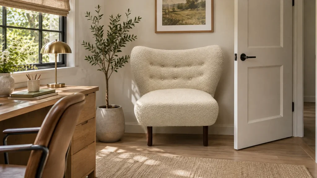
A fabric colour tolerance that does not reject usable rolls is a small, agreed band around an approved physical standard, defined in a specific light and measured on a specific surface. In practice, most buyers get better yield by setting a tight limit on hue and a looser limit on lightness, then excluding texture-driven variation from the pass/fail count. Approve the standard under the same lamp and viewing angle used at inspection, record the numeric readings of that standard, and write a rule that says which deviations trigger rejection and which are accepted as normal production spread.
The practical question behind “fabric colour tolerance usable rolls” is best answered with room measurements, construction details, and the chair’s intended use considered together.
The problem this solves is economic as much as aesthetic. A tolerance so wide that panels from different rolls clash in one room destroys the consistency you paid for; a tolerance so narrow that it rejects every roll with a slightly different pile direction destroys yield and pushes cost into the price. The aim is a band that keeps a single upholstered piece, and a set of pieces in one room, visually coherent while allowing the mill to deliver the bulk of a dye lot.
This guide sets out how to build that band, how to light the check, how to separate true shade drift from surface texture, and how to make a pass/fail call that both a factory and a design team can defend. It applies to upholstery fabric for residential seating, contract furniture, and hospitality projects where repeat orders and replacement covers matter.
The direct answer: define a band, not a single colour
A workable tolerance is a three-part agreement. First, an approved standard: a physical swatch, sealed, dated, and retained by both buyer and supplier. Second, a measurement method: the instrument, the aperture size, the number of readings, and the surface condition. Third, a decision rule: which colour coordinates may move, by how much, and under what light.
Most upholstery programmes work well with a rule that limits hue and chroma tightly while permitting a slightly wider lightness range, because the eye forgives small shifts in depth more readily than a shift from warm to cool or from muted to vivid. The exact numbers depend on the fabric, the colour family, and how the panels will be cut and sewn. A neutral greige, a deep navy, and a saturated rust do not behave the same way, and a single numeric band applied to all three will either over-reject or under-protect.
The band should also state what it does not govern. Texture, pile direction, and the way light rakes across a woven surface are not colour faults, and counting them as failures is the most common reason usable rolls are rejected. Separate the two questions before you write the rule: is the shade wrong, or is the surface simply catching the light differently?
Why rolls drift, and where a tolerance has to stop
Dyed-lot and lot-to-lot variation
Yarn dyeing and piece dyeing both produce variation between lots. Within a single dye lot, the spread is usually smaller, but it is not zero, particularly on long runs where the dye bath is replenished. The tolerance has to accommodate normal within-lot spread while flagging a genuine lot-to-lot shift that would be visible when two rolls sit side by side on the same frame.
Verify this by asking the mill for the colour readings of the approved lot and the current lot, taken on the same instrument with the same settings. If the mill cannot supply readings, ask for a retained sample from each lot and measure them yourself under controlled light. A supplier who can show the numbers is easier to hold to a band than one who only offers an opinion.
Fibre, weave, and pile effects
Natural fibres vary more than synthetic ones, and blends inherit the variability of their components. A linen-rich weave will usually show more lot-to-lot movement than a solution-dyed synthetic. Pile fabrics, velvets, and brushed surfaces change apparent colour with direction, so the same roll can read two different shades depending on how the nap lies.
Construction matters too. A loose weave with a visible ground shows the ground colour through the face, and a change in ground shade can shift the overall appearance even when the face yarn is on target. Ribs, cords, and heavy textures create shadows that read as darkening. None of these are dye faults, and the tolerance rule should say so explicitly.
Finishing, backing, and heat
Backing, flame-retardant treatments, and heat-setting can alter apparent shade. A coated back may stiffen the face and change how it reflects light. Finishing that pulls or relaxes the weave can change the density of threads per centimetre and therefore the perceived depth of colour. If a fabric is supplied both backed and unbacked, treat them as separate standards rather than assuming one band covers both.
Choosing the light and the viewing conditions for the check
Colour is a relationship between a surface, a light source, and an observer. Change the light and the same fabric reads differently. That is why the tolerance must name the light source. For most upholstery work, a controlled inspection light in the 4,000–5,000 K range with a high colour-rendering index is a sensible default, because it sits between warm domestic lighting and cool daylight and does not exaggerate either.
Metamerism is the trap here. Two samples can match under one lamp and diverge under another. If your customer will see the furniture under warm incandescent light in the evening and cool daylight through a window by day, check the candidate roll under both and note any divergence. A roll that matches the standard under the inspection lamp but splits badly under domestic warm light is a risk worth flagging before it is cut.
Viewing geometry and the texture trap
Fix the angle. A raking view across a pile fabric will show every directional change; a perpendicular view flattens it. Standardise on a viewing angle, typically around 45 degrees from the surface, and keep the distance consistent. Rotate the sample and the roll through 90 degrees and compare again, because directional fabrics can look different along the warp and across the weft.
This is where texture is separated from shade drift. If the difference disappears or reverses when you rotate the sample, it is directional and belongs to surface behaviour, not to colour. If the difference persists in the same direction regardless of rotation, it is a genuine shade shift and should be measured.
Measurements that make the decision defensible
Instrumental measurement turns an argument into a record. A spectrophotometer with a defined aperture, usually 8 mm or 10 mm for upholstery, gives colour coordinates that can be compared numerically. Take multiple readings per sample, at least three, and average them. Record the standard deviation so you know whether the roll is uniformly off or patchy.
Report results in a system both sides understand. CIELAB coordinates (L*, a*, b*) are widely used, and the colour difference ΔE summarises the gap. State which ΔE formula you are using, because older and newer formulas weight lightness, chroma, and hue differently and will not give identical numbers. Agree the formula in the specification so a passing roll does not fail on a technicality.
| Measurement element | What to specify | How to verify |
|---|---|---|
| Instrument and aperture | Spectrophotometer, 8–10 mm aperture, same model both ends | Compare calibration certificates and a shared check tile |
| Light source | Defined illuminant, typically D65 for measurement, agreed lamp for visual check | Record illuminant setting on every report |
| Readings per sample | Minimum three, spread across the width | Check the spread; a wide spread signals patchiness |
| Surface condition | Face up, nap in one direction, no creases | Photograph the setup; repeat on a second operator |
| Colour difference formula | One named formula, applied consistently | Re-measure the approved standard and confirm near-zero |
A practical safeguard is to measure the approved standard on the same day as the candidate roll. Instrument drift is small but real, and a fresh reading of the standard anchors the comparison. Keep the standard sealed and away from light, because a swatch left on a windowsill will fade and quietly move the target.
Materials and construction: where the band should flex
Tolerance bands are not universal. A tight band suits flat, smooth, piece-dyed fabrics in a solid mid-tone, where any drift is obvious. A wider band suits heavily textured, pile, or multi-colour yarn fabrics, where surface variation dominates the visual impression and a small coordinate shift is lost in the texture.
Colour family changes the calculus. Deep saturated colours compress differences in lightness, so a lightness shift that would be invisible on a pale grey can look like a different fabric on a dark navy. Conversely, pale neutrals show hue drift readily, so a warm-to-cool shift on an off-white reads as a mismatch even when the numeric difference is modest. Set the band per colour family, not per order.
If the fabric will be used on seating with visible seams and pattern matching, the tolerance should also address how panels from different rolls are laid out. A pair of chairs upholstered from two rolls at opposite ends of the band can look mismatched even if both pass individually. The fix is a cutting rule: keep one piece per roll where possible, and reserve the widest-tolerance rolls for pieces that will not sit beside a tight-tolerance roll.
Construction details that affect the check include backing weight, coating, and whether the fabric is railroaded. A railroaded cut changes the direction of the weave relative to the viewer and can make the same roll read differently. Record the intended cut direction on the standard so the inspection matches the finished orientation. Buyers sourcing across a range of pieces will find it useful to review the full upholstered seating and furniture collection to see how many different fabrics and orientations a single project may involve.
A decision process that protects consistency and yield
The decision should follow a fixed order so that texture is ruled out before shade is judged. Start with the visual check under the agreed lamp, then rotate to test for directionality, then measure if a difference remains. Only after measurement should the pass/fail rule be applied.
Step one: confirm the standard
Before judging any roll, confirm that the physical standard is the correct one, is within its service life, and matches the recorded readings. A surprising number of disputes trace back to an outdated or faded standard rather than a bad roll.
Step two: visual screen under agreed light
Place the roll face up beside the standard at the agreed angle and distance. View from about a metre, then closer. Rotate both through 90 degrees. Note whether any difference is directional, patchy, or uniform. Photograph the setup for the record.
Step three: measure and compare
Take at least three readings on the roll and compare with the standard’s recorded values. Look at the components, not just the total difference. A roll that is off mainly in lightness is a different commercial decision from one that is off mainly in hue.
Step four: apply the band and the cutting rule
If the roll is inside the band, it passes. If it is outside on hue or chroma, it fails. If it is outside on lightness only and within the wider lightness allowance, it may pass conditionally, subject to the cutting rule that keeps it away from tight-tolerance rolls in the same visible grouping. Record the condition on the inspection sheet so the factory knows how to use it.
| Observation | Likely cause | Decision |
|---|---|---|
| Difference reverses when rotated | Pile or weave direction | Pass; note cut direction |
| Uniform shift in hue, persists on rotation | Dye lot drift | Fail if outside hue limit |
| Patchy variation across the width | Uneven dyeing or finishing | Fail; high spread in readings |
| Slightly darker overall, hue on target | Lightness drift within allowance | Conditional pass; apply cutting rule |
| Matches under one lamp, splits under another | Metamerism | Flag; decide against the end-use light |
Use cases: how the band changes with the job
Residential seating. A single sofa or a pair of chairs in one room needs a tight hue band, because the pieces sit together and the eye compares them directly. Lightness can be slightly looser, especially on textured fabrics. Verify by viewing the finished pieces together under the room’s actual lighting, not only in the workshop.
Hospitality and contract. Large orders span multiple rolls and often multiple dye lots. Consistency across a public space matters, but so does yield, because rejecting rolls mid-project delays installation. A two-tier rule works well: a tight band for pieces in the same sightline, a wider band for pieces in separate rooms or separated by distance. Record which tier each roll is assigned to.
Replacement and repair. Matching a single replacement cover to furniture already in service is harder than matching new production, because the existing fabric has aged and may have faded. Expect a wider apparent difference and set expectations in writing before ordering. A close match under the room’s light is usually the realistic goal, and the original standard may no longer represent the in-service colour.
Design-led pieces. Where the fabric is a feature, such as a patterned or textured seat, the tolerance should follow the visual weight of the colour. A patterned fabric with a dominant ground colour needs the ground checked, not the whole surface. For a patterned accent piece, review the intended abstract line pattern chair to judge how much of the fabric is visible and how much tolerance the design can absorb.
Buyer checklist: pass, fail, and verify
Use this checklist at the point of inspection. Each line should produce a clear record, not a verbal opinion.
| Check | Pass condition | Fail or verify action |
|---|---|---|
| Approved standard present and sealed | Dated, signed, stored away from light | Verify against retained readings; replace if faded |
| Inspection lamp matches specification | Agreed colour temperature and rendering | Verify with a lamp meter or shared reference tile |
| Rotation test completed | Directional effects identified and excluded | Verify by rotating both samples 90 degrees |
| Readings taken and recorded | Three or more per sample, averaged | Verify spread; re-measure if patchy |
| Hue and chroma within limit | Inside the agreed band | Fail if outside; do not average away a hue shift |
| Lightness within allowance | Inside the wider lightness band | Conditional pass with cutting rule noted |
| End-use light checked | No unacceptable metameric split | Verify under warm and cool sources |
| Cut direction recorded | Matches the standard’s orientation | Verify against the cutting ticket |
For projects where the fabric must work with a specific chair geometry, it helps to confirm the seat proportions and dimensions before finalising the cutting rule. The chair seat height guide and the lounge chair dimensions reference show how panel size and visible fabric area affect how much colour variation a piece can hide.
Maintenance and storage of the standard and the records
The standard is only useful if it stays representative. Store it flat, sealed, and out of daylight. Handle it with clean hands or gloves, because oils transfer to the surface and change its reflectance. Replace it on a defined cycle, or sooner if it has been used heavily or exposed to light.
Keep the measurement record with the standard. A standard without its readings is an opinion; a standard with dated readings is evidence. When a dispute arises, the record shows whether the roll moved or the standard did. Retain inspection sheets for the life of the order and for any replacement programme that may follow.
Maintain the inspection lamp as well. Lamps age and shift in colour temperature. Replace them on a schedule or verify against a reference tile. A drifted lamp can pass rolls that would fail under the specified light, quietly widening the band without anyone agreeing to it.
The fabric itself needs care after installation. Regular light cleaning and immediate attention to spills keep the surface reflectance stable, and rotating cushions where possible spreads wear. For a broader view of how upholstery choice and care interact, the chair upholstery fabric guide covers the practical side of selection and upkeep.
Verification: proving the band works before you rely on it
A tolerance written on paper is a hypothesis until it is tested against real rolls. Before locking a programme, run a pilot: inspect a batch of rolls against the band and record how many pass, fail, and pass conditionally. If the failure rate is high, the band is probably too tight or the measurement method is picking up texture. If nothing ever fails, the band may be too loose to protect consistency.
Compare the pilot results with the visual judgement of the people who will live with the furniture. A band that passes rolls the design team finds mismatched is not doing its job. Conversely, a band that rejects rolls the team cannot distinguish is costing money for no visible benefit. Adjust the band, re-run the pilot, and document the change.
Finally, verify the supplier’s end of the process. Ask for their inspection records, confirm the instrument and light source, and check that their standard matches yours. If both sides measure the same way, the conversation stays about the fabric rather than about whose method is right. Buyers who need to align these details across a project can raise specific questions through the contact page for sourcing and order enquiries.
Conclusion
A fabric colour tolerance that protects both consistency and yield is built from three things: a sealed physical standard with recorded readings, a defined light and viewing method, and a decision rule that limits hue tightly while allowing more room on lightness. Separating directional texture from genuine shade drift is what stops usable rolls from being rejected.
Write the band per colour family and per end use, test it against a pilot batch, and keep the records with the standard. Done this way, the tolerance becomes a shared, verifiable agreement rather than a matter of opinion, and the rolls that pass are the ones that will look right together in the finished room.
FAQ
What is a reasonable colour tolerance for upholstery fabric?
There is no single universal number, because it depends on colour family, texture, and end use. A common approach is a tighter limit on hue and chroma and a wider allowance on lightness, agreed in a specific light and measured on a defined surface. The right figure is the one your pilot batch shows protects visual consistency without rejecting most of a dye lot.
How do I tell shade drift from texture?
Rotate the sample and the roll through 90 degrees and compare again. If the difference reverses or disappears with rotation, it is directional and belongs to pile or weave behaviour. If the difference persists in the same direction regardless of rotation, it is a genuine shade shift and should be measured.
Which light should I use for the inspection?
Use a controlled inspection lamp in the 4,000–5,000 K range with high colour rendering, and keep the angle and distance consistent. Also check the fabric under the light where it will actually be used, because two samples can match under one source and diverge under another. Record the lamp specification so the check can be repeated.
Can I use one tolerance for every colour in a range?
It is better to set the band per colour family. Pale neutrals show hue drift readily, while deep saturated colours compress lightness differences and can look like a different fabric after a small shift. A single band across a whole range will usually over-reject some colours and under-protect others.
What should happen to a roll that is slightly dark but the right hue?
If it sits within the agreed lightness allowance, it can pass conditionally, provided a cutting rule keeps it away from tight-tolerance rolls in the same visible grouping. Record the condition on the inspection sheet so the factory knows how to use it. A uniform lightness shift that stays inside the band is usually far less visible than a hue shift.
How often should the approved standard be replaced?
Replace it on a defined cycle and sooner if it has been handled heavily or exposed to light. Store it flat, sealed, and away from daylight, and keep its dated readings with it. If a dispute arises, re-measure the standard first to confirm it still represents the approved colour before judging the roll.